Rebrand & Redesign
NationSwell
NationSwell is a social impact company that works with individuals, brands, and organizations to provide strategy, community, and storytelling.
A combination of a full-service agency, influencer membership community, and editorial publication, NationSwell focuses on the issues and campaigns that tackle social, economic, environmental themes and mobilizes communities in support of key issues.

The old and the new
In the years since NationSwell’s launch, the startup’s focus and identity had changed. It was time for the visual and language systems to catch up.
As Creative Director, I lead the rebrand and introduced a new type system, color palette, visual language, icon system, and expression. This was a lot of change, but it was anchored in more fully realising the identity of the NationSwell brand. Highlights include:
Typography: Pragmatic, sharp, and energetic type underscores NS’ efforts to communicate clearly. One of the brand’s existing fonts, Founders Grotesk, was retained and represents credibility and continuity. I also introduced a modern serif typeface to represent the human forces that drive and inspire NS’s work. Tonally it represents balanced energy: sturdy but versatile, masculine and feminine, thin and thick elements to the characters (steps vs tails and ears).
Color: The primary colors represent frankness, continuity, and balance. The brand black and white stabilize each other, symbolizing justice and equality. Meanwhile, putty offers a subtle visual variation to white and the yellow is the potential of our future. The secondary palette offers both a high energy and calm variant that scale across the NS voice and issue areas. They are notably not aligned with Western political parties, to message that the work is non-partisan.
Highlight: A graphic, yellow highlight was introduced. It expresses the human center of our brand - a hands-on, “roll up your sleeves and do the work” attitude. The highlight is unique in the system: It’s the only hand-drawn element in our visual identity.

Website Redesign
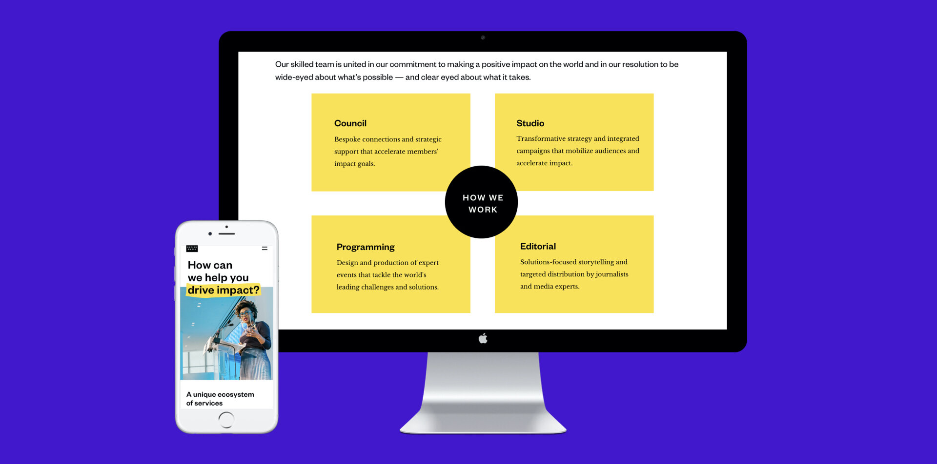
In addition to a refreshed brand identity, NationSwell needed a updated digital identity - one that was inspiring, clear-voiced, and user-friendly.
As Creative Director, I lead a team of designers and developers to create page layouts, functionalities, animations, and expressions that offered beauty and utility to a diverse range of users.
Desktop page
Mobile page
The team
Creative Director: Jessica Lacombe
Site copy: Amy Lee
Visual designers: Mary Bana, Nina Raj, Divya Das
Developer: Robbie Sherrard
Video editor: Drew Blatman

