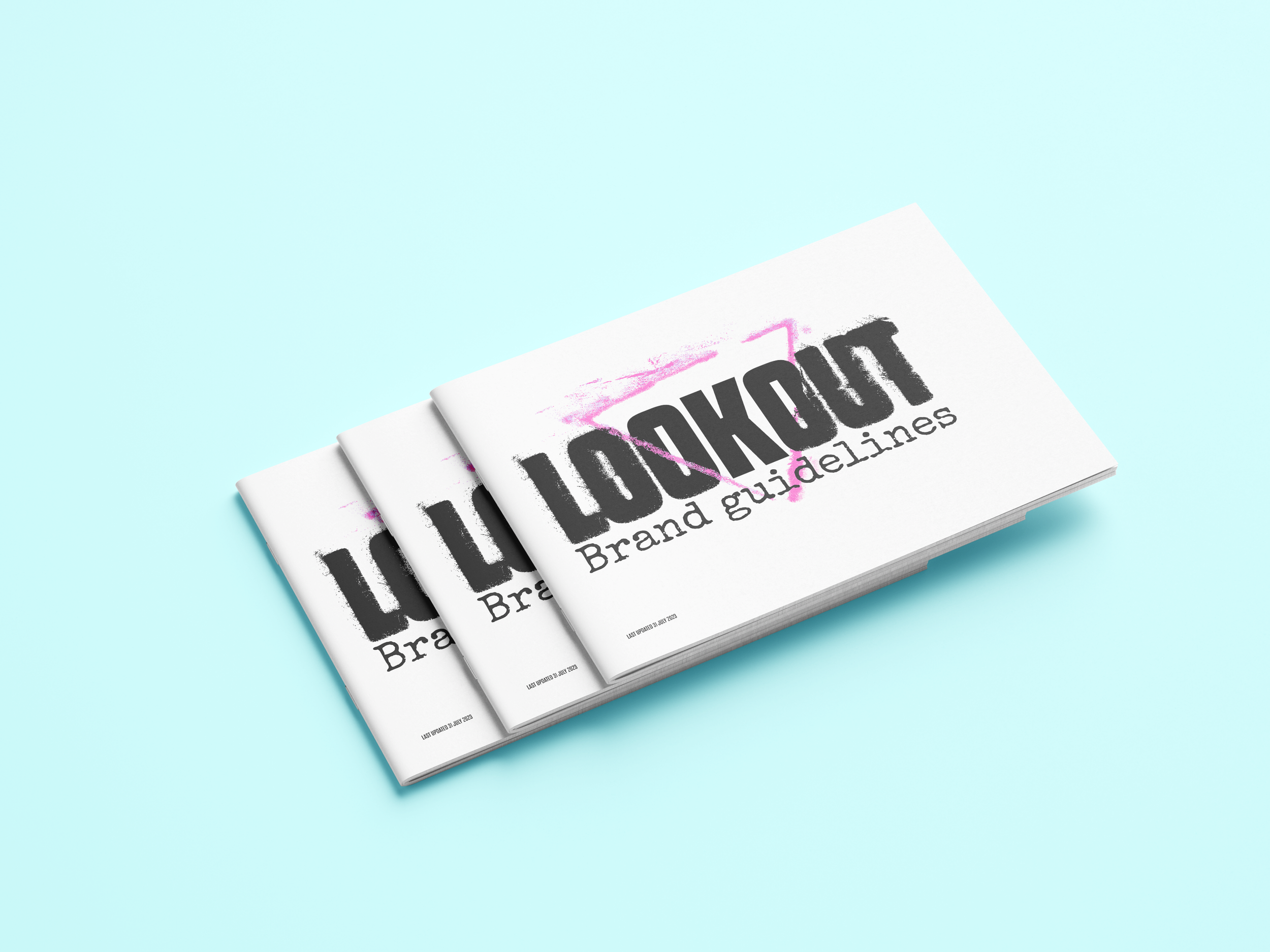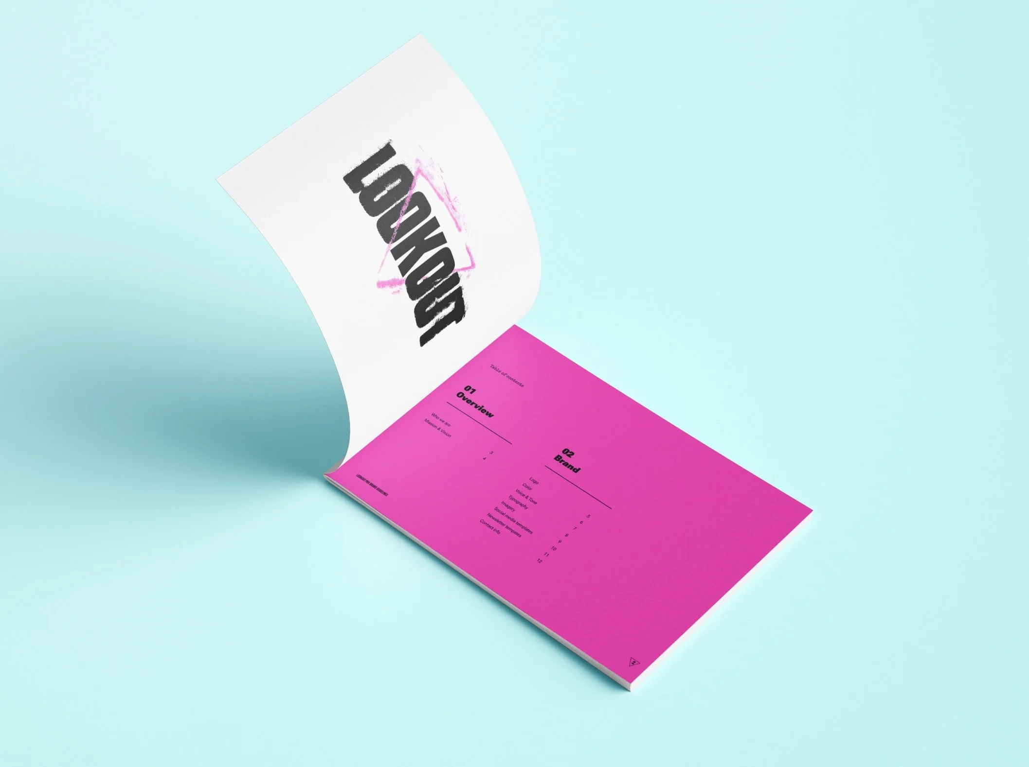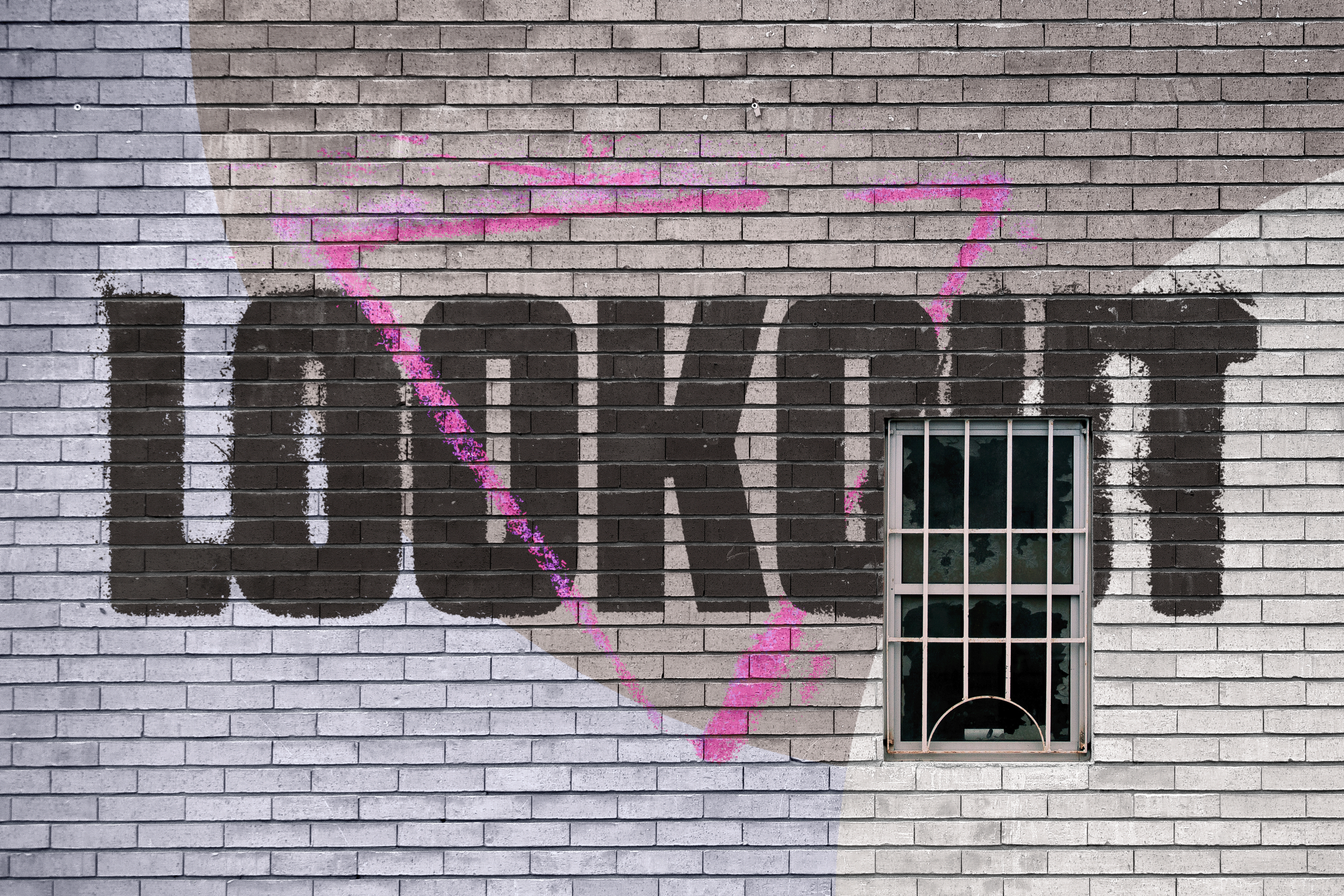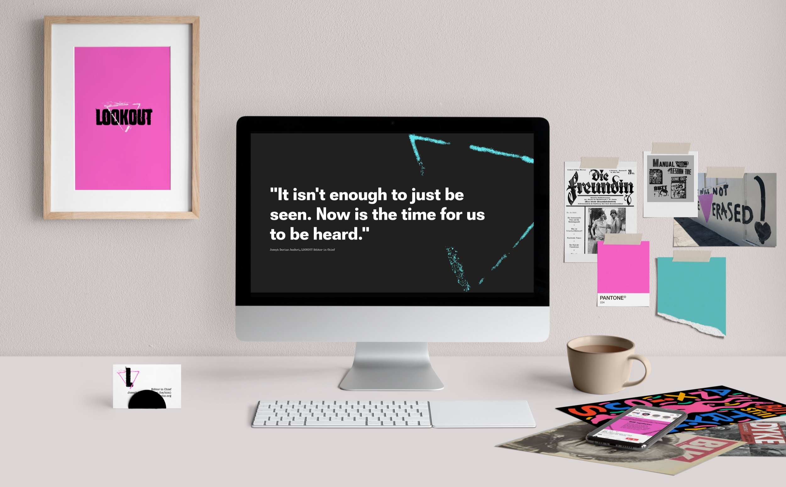
A brand identity for a disruptive news org
LOOKOUT is a multi-disciplinary organization that’s mission is to deliver fearless journalism, content, and events with the unified purpose of improving and expanding LGBTQ+ representation on the national news stage and engaging LGBTQ+ communities (and their allies) in the queer experience.
We created a brand identity for LOOKOUT that can stand alone or partner with existing brands to amplify their impact.
Setting the tone, heart, & promise
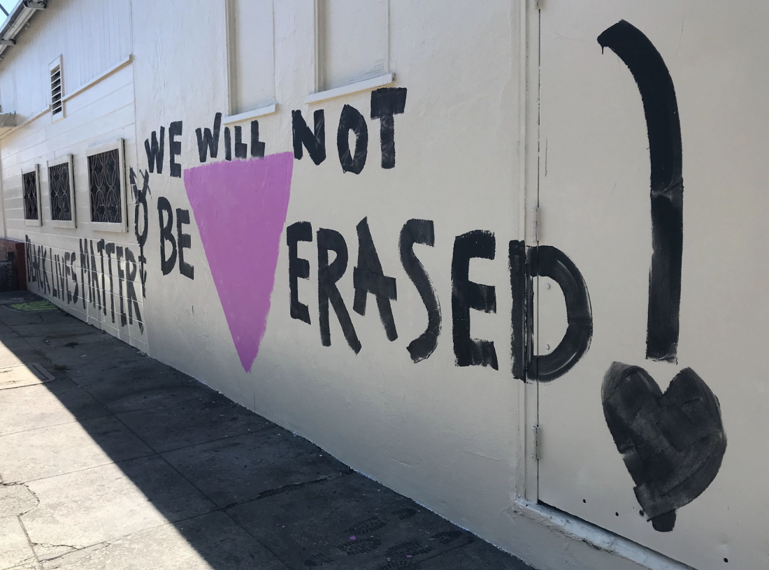
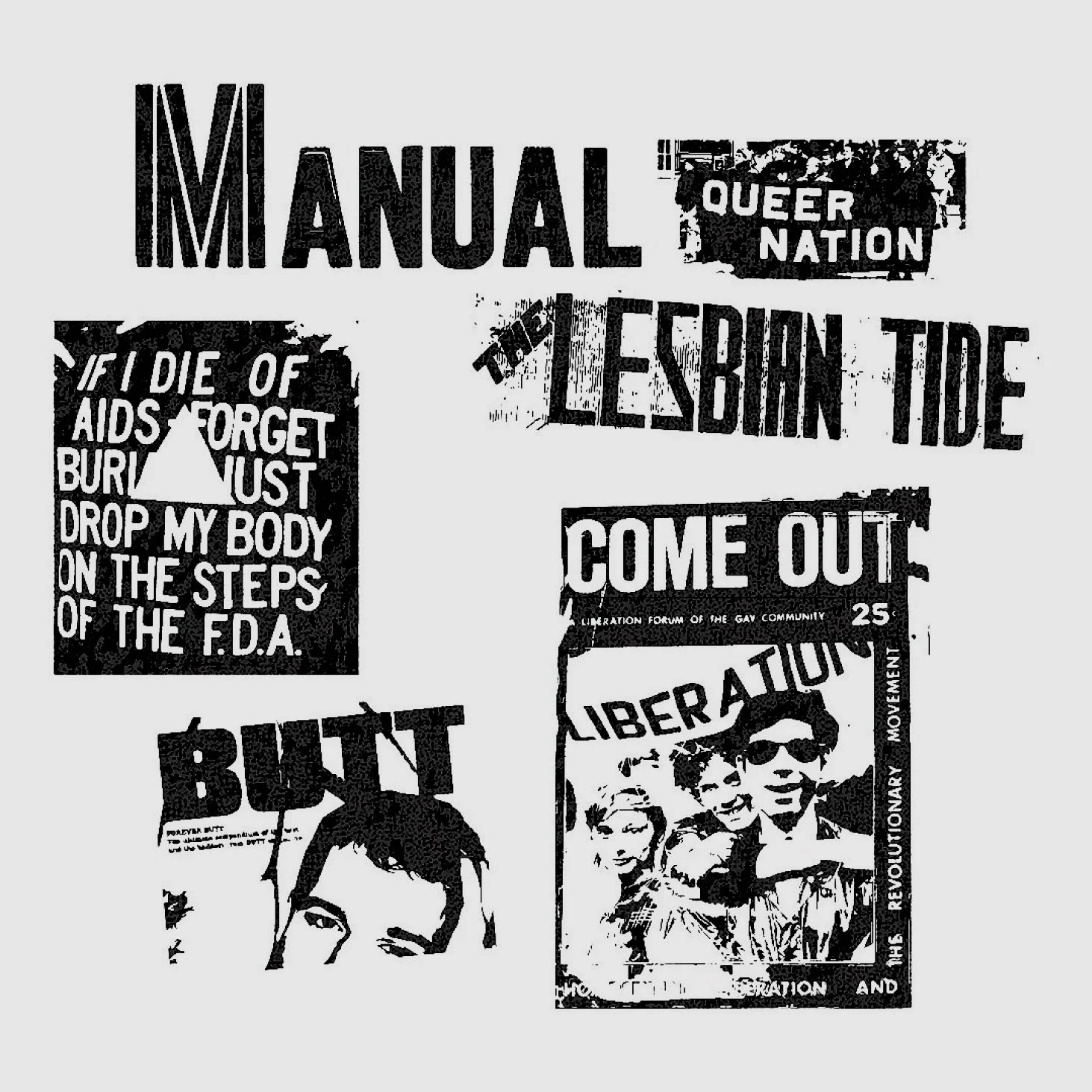
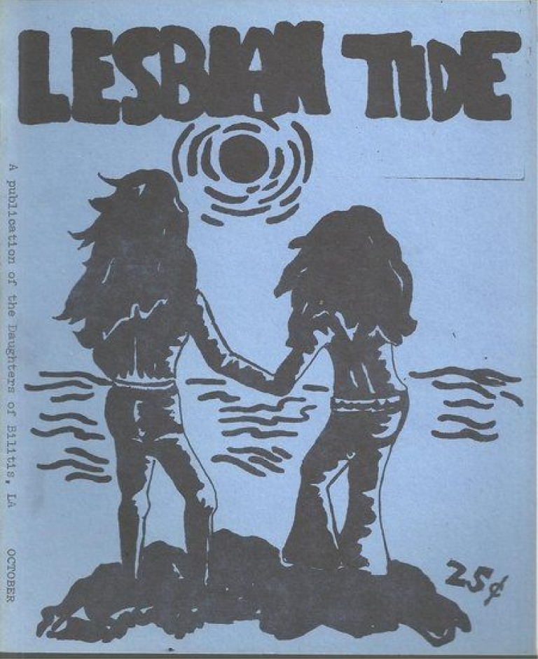
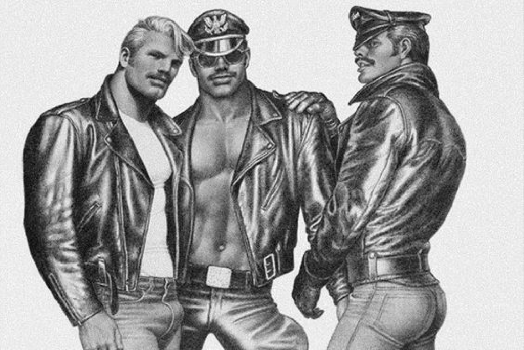
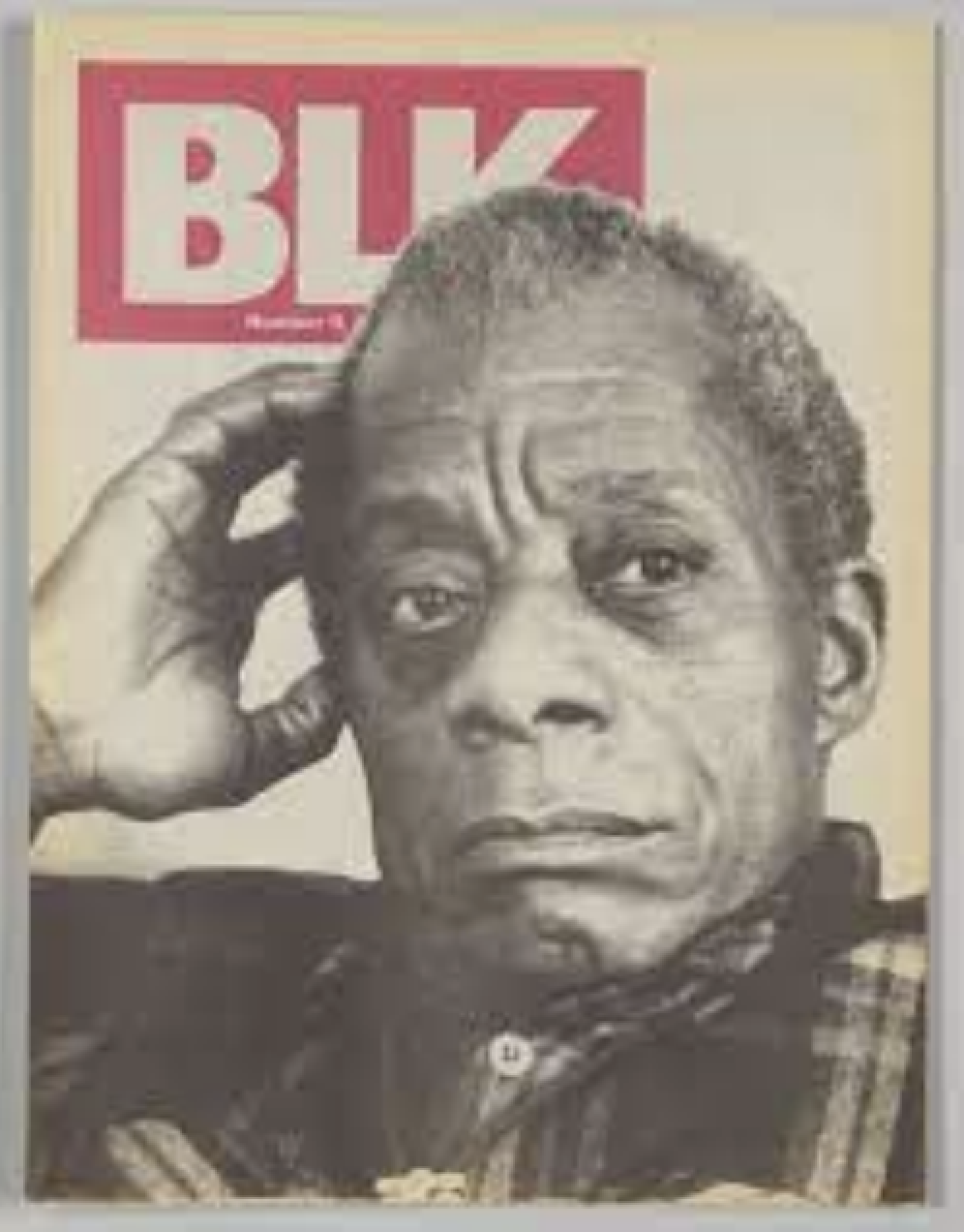
The brand identity was built on the foundation of the 1960s and 1970s queer liberation movement and references, including grassroots posters and zines.
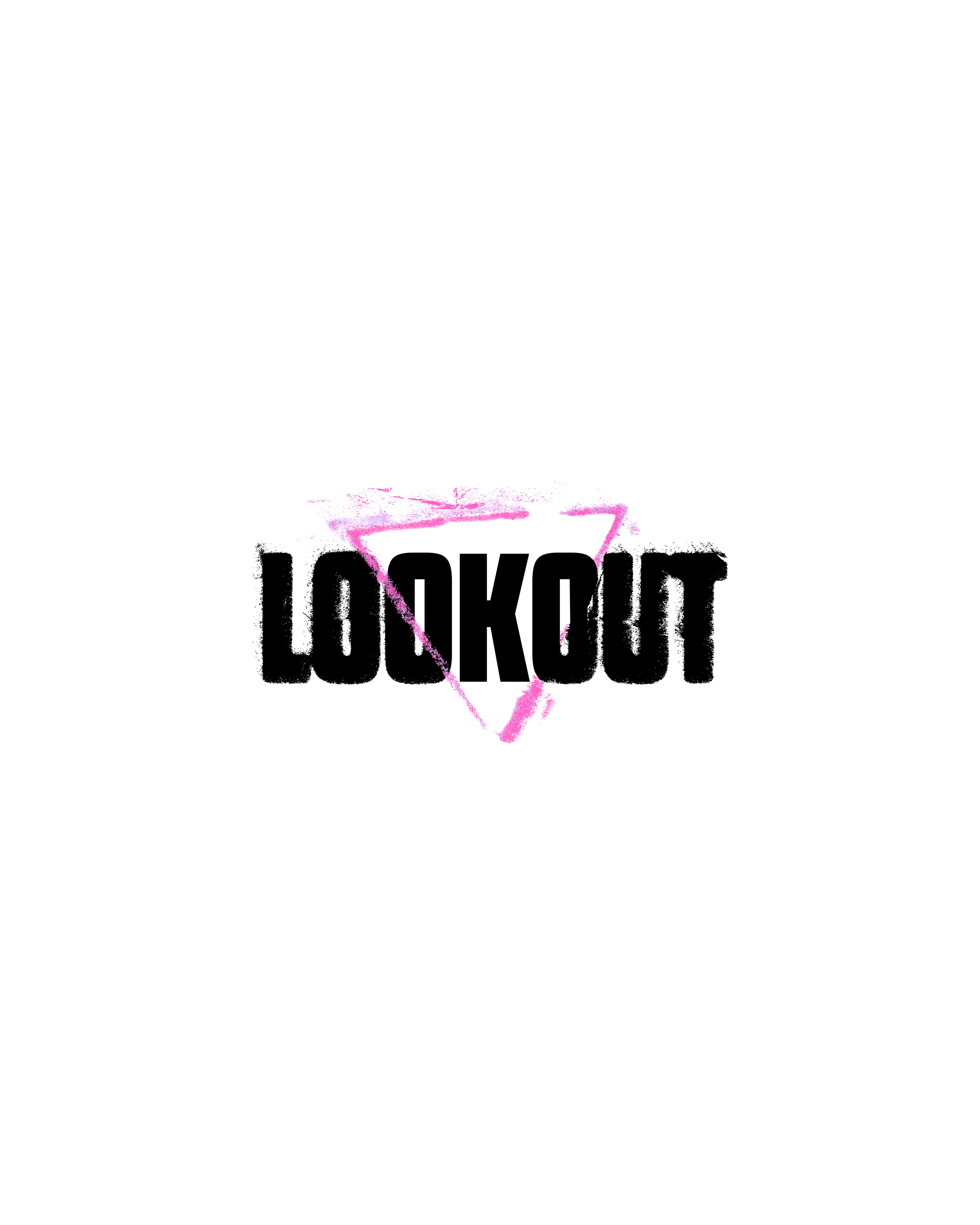
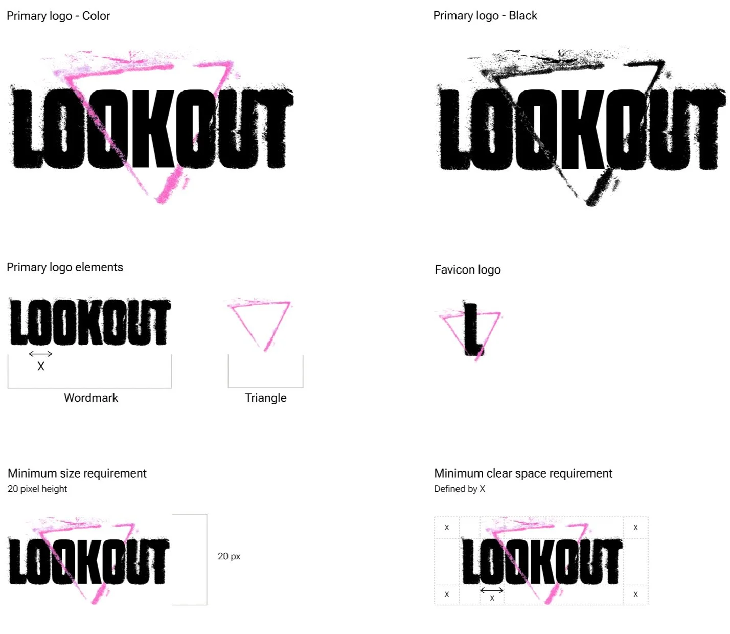
Logo
The Triangle invokes the historical legacy of LGBTQ+ publications
It wraps around the words, creating clarity, meaning, and inviting the LGBTQ+ community and its allies to come inside the issues with us. To further express LOOKOUT’s identity as journalistic organization, the characters inside the triangle are in sharp focus, while the characters outside the triangle include print errors.
The Wordmark represents stability, truth, and credibility. Together, these elements form a single unit that our audiences will identify with the LOOKOUT brand.
Typography
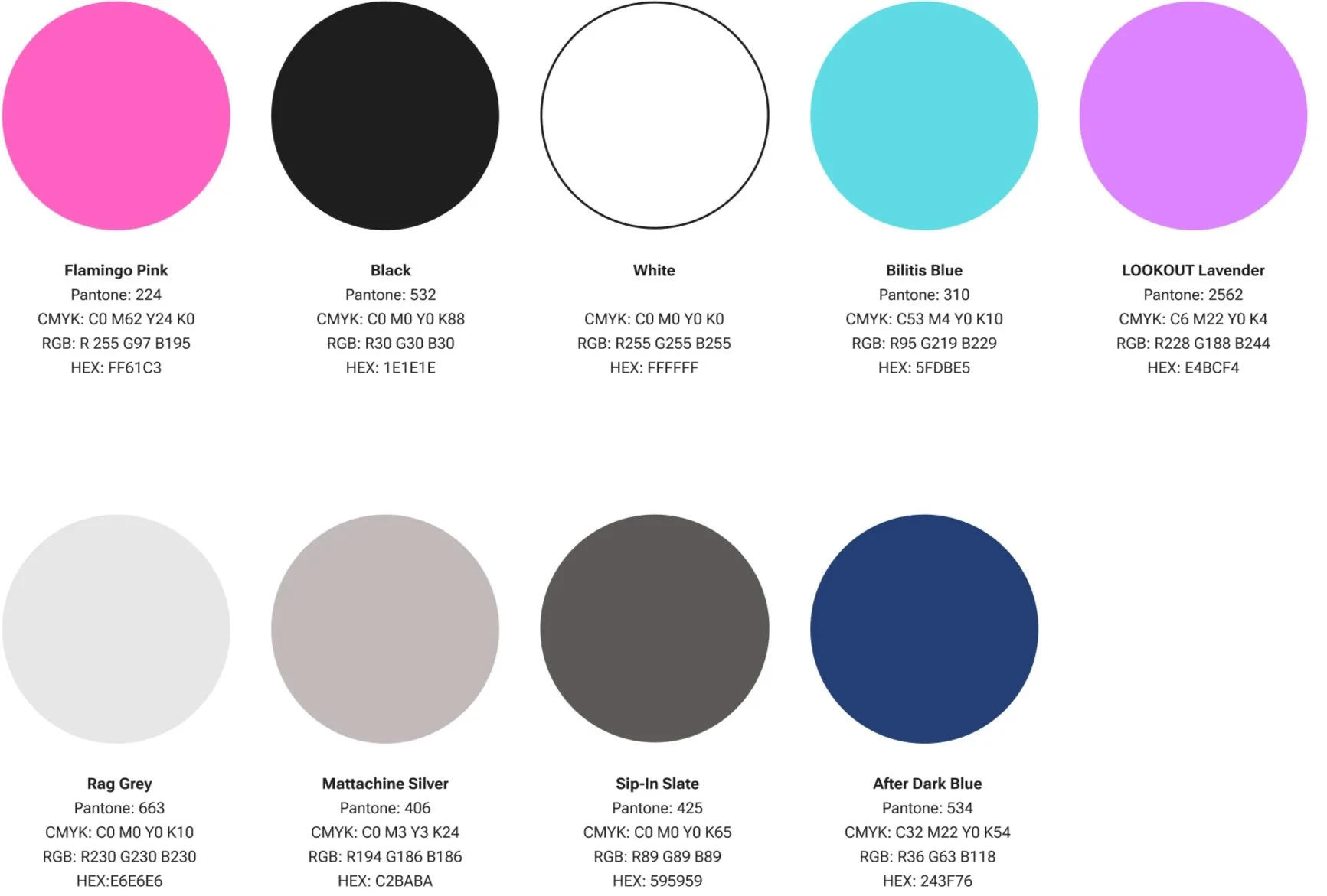
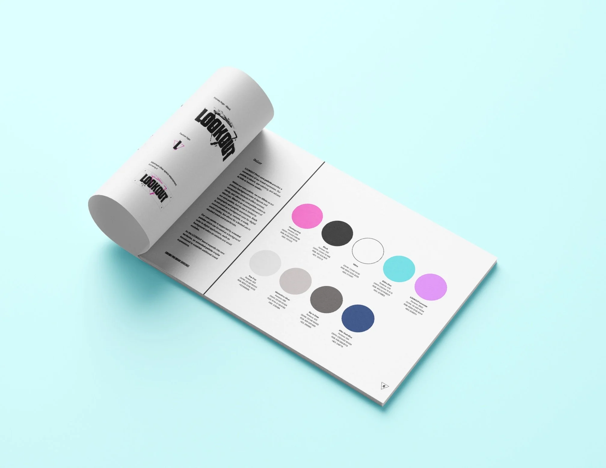
LOOKOUT’s palette is vibrant, eye-catching, and refuses to hide or become smaller
The core palette provides a cornerstone of our brand expression. Our colors do the hard work of referencing the past - whose shoulders LOOKOUT stands upon - and delivering on its promise for/to a contemporary audience.
Color selection and naming were one of the most joyful parts of this work.
Voice, Tone, & Personality
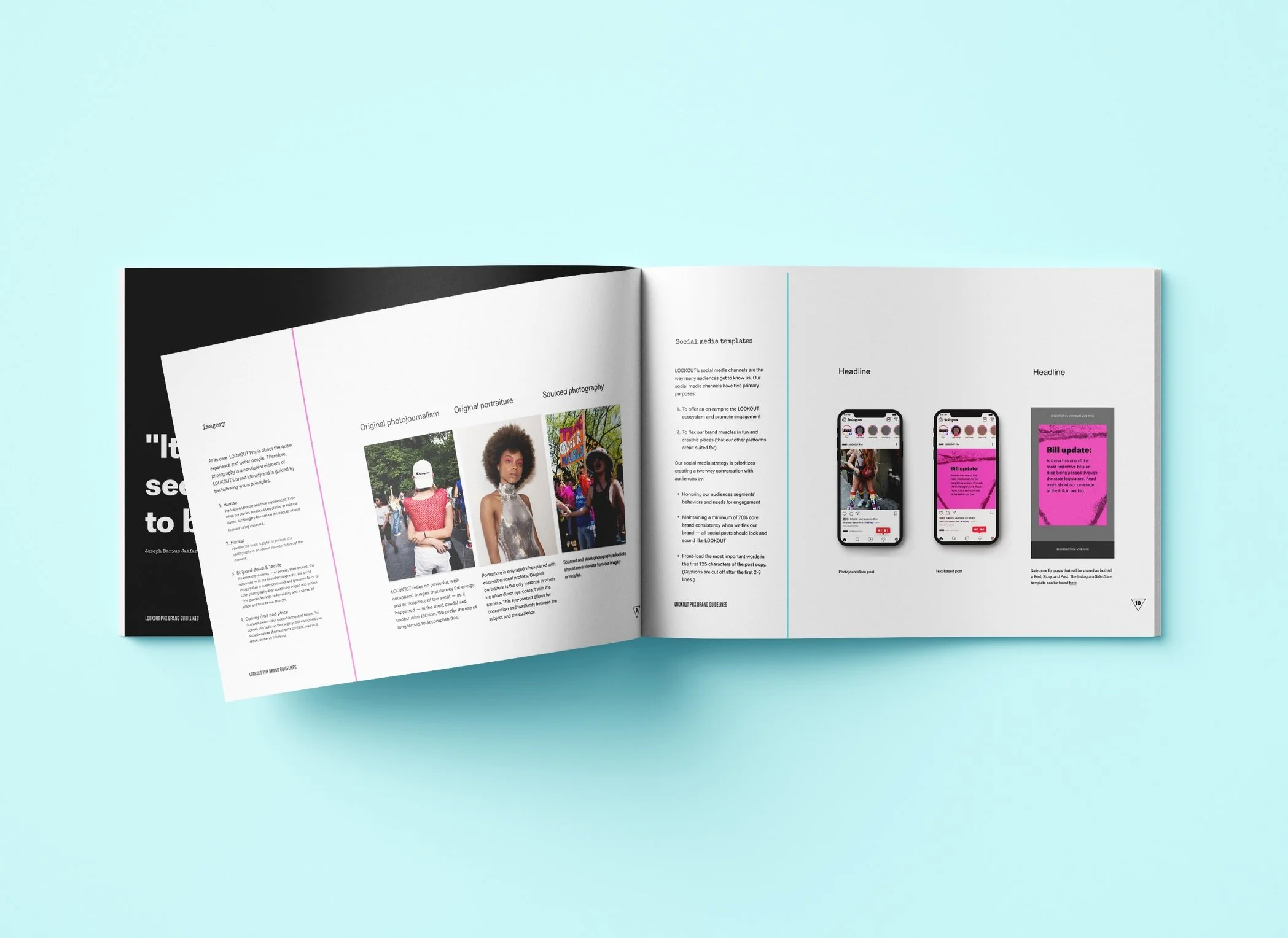
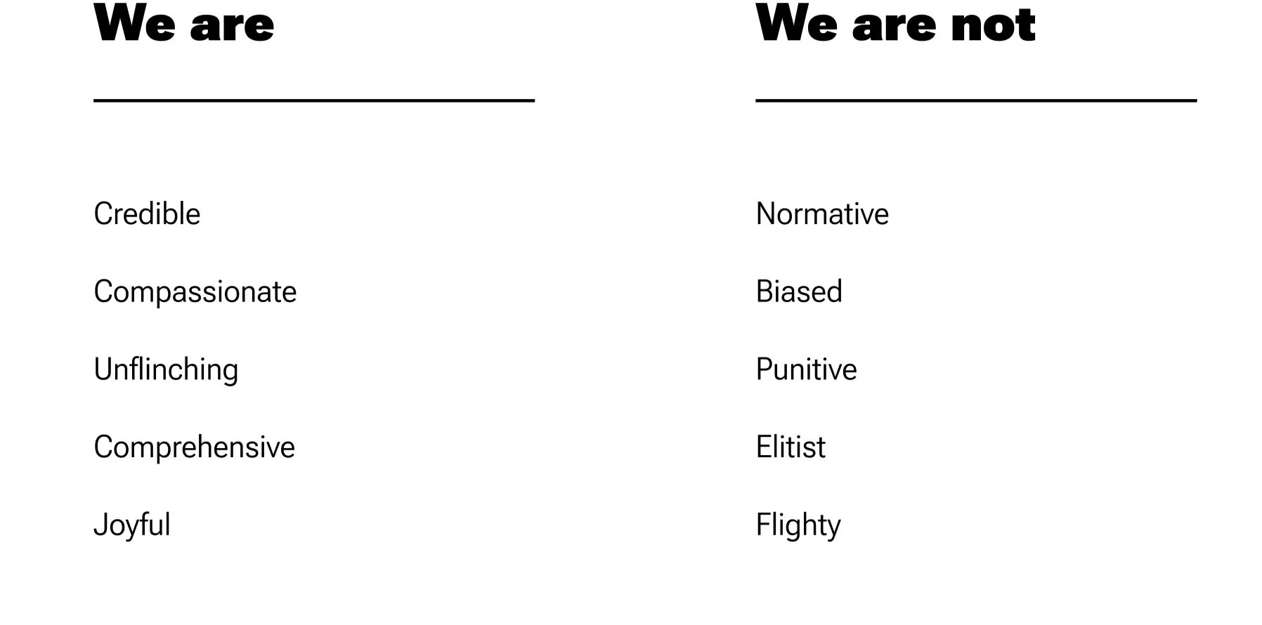
LOOKOUT shouldn’t sound like any previous publication, but it must sound like our LGBTQ+ community
In creating LOOKOUT Phx’s Voice & Tone, we prioritized these things:
Align to LOOKOUT’s short and long-term strategy and goals
Honor and authentically embody the LGBTQ+ community - and LOOKOUT’s relationship with them
Create a voice that we can use across diverse touchpoints (journalism, social media, events, experiences, etc.)
Future-proof our voice to be flexible and evolve alongside the LGBTQ+ experience
Typography
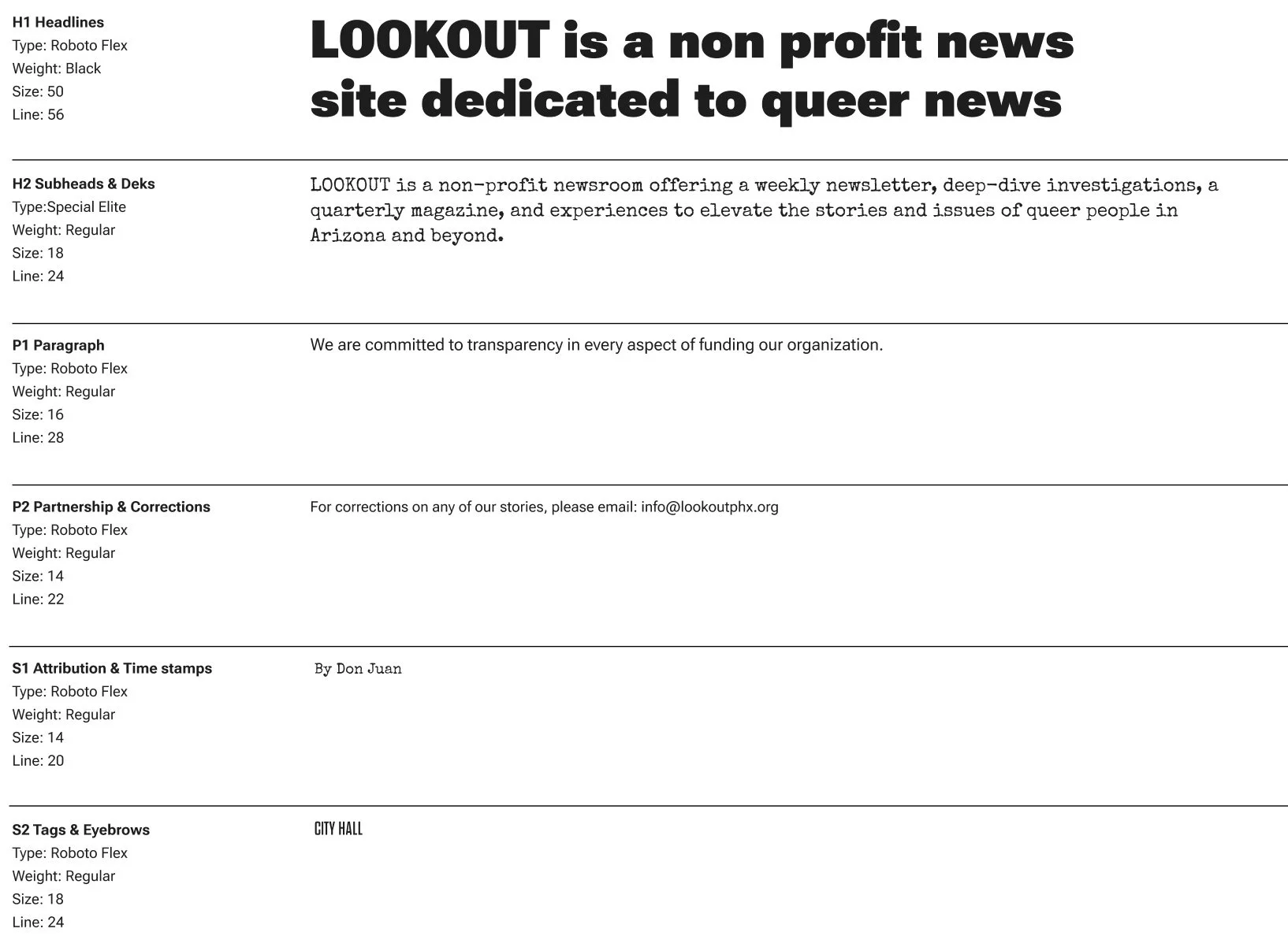
Type styling and setting create a visually accessible brand expression, ensuring legibility and differentiation
The type system hierarchy allows LOOKOUT to create accessible content across web, social, fundraising, events, marketing, and print with consistency. joy and historic reference to the LGBTQ+ liberation movement throughout history.
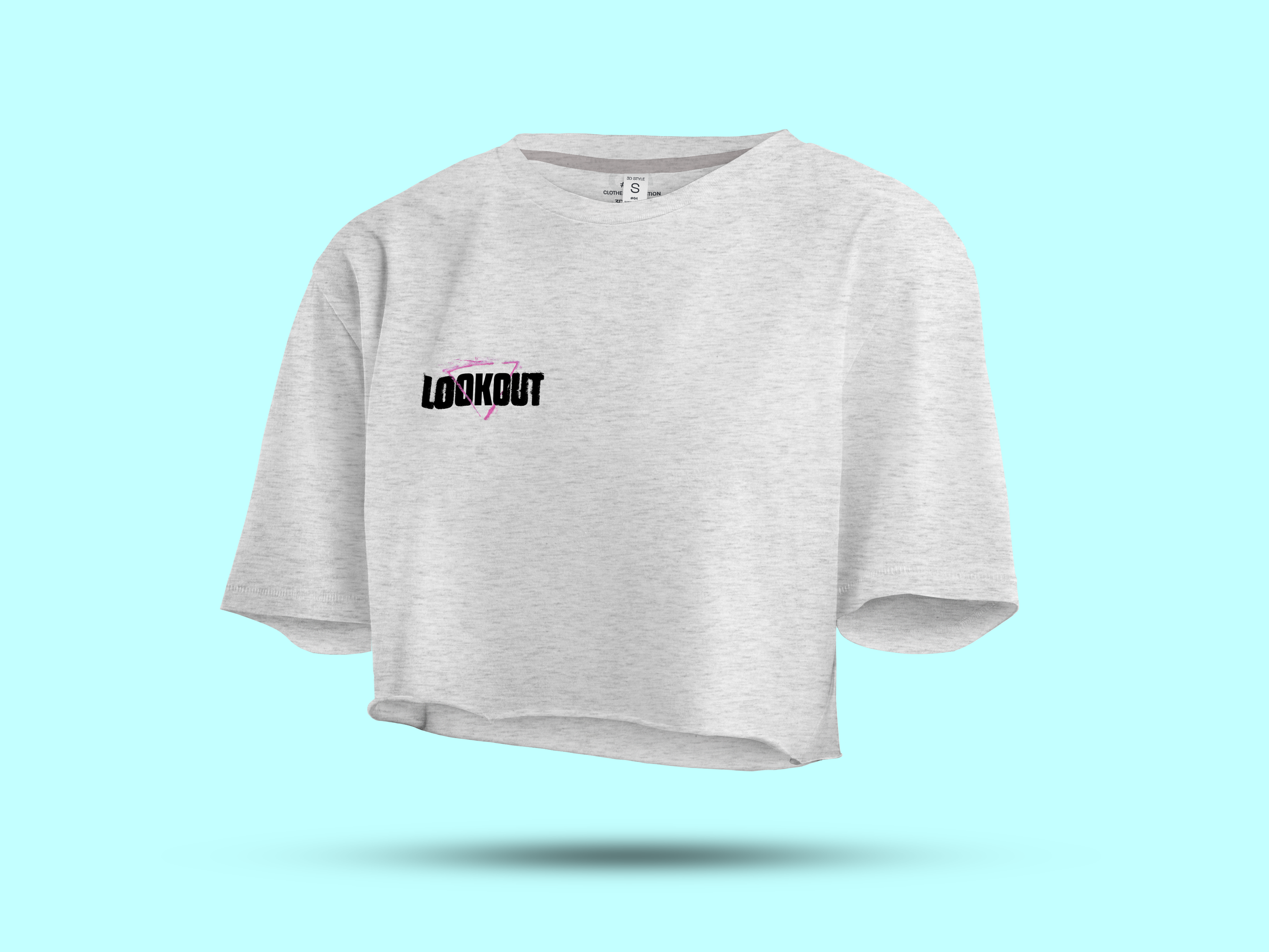
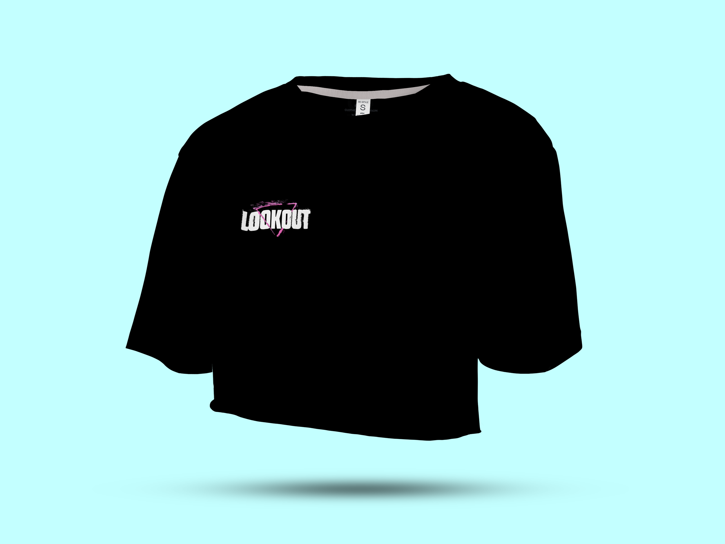
Pride & Conference collateral
The team
Co-Creative Directors, Designers, Copywriters, Pixel-pushers, & Overworkers:Jessica Lacombe & Nina Raj :)
