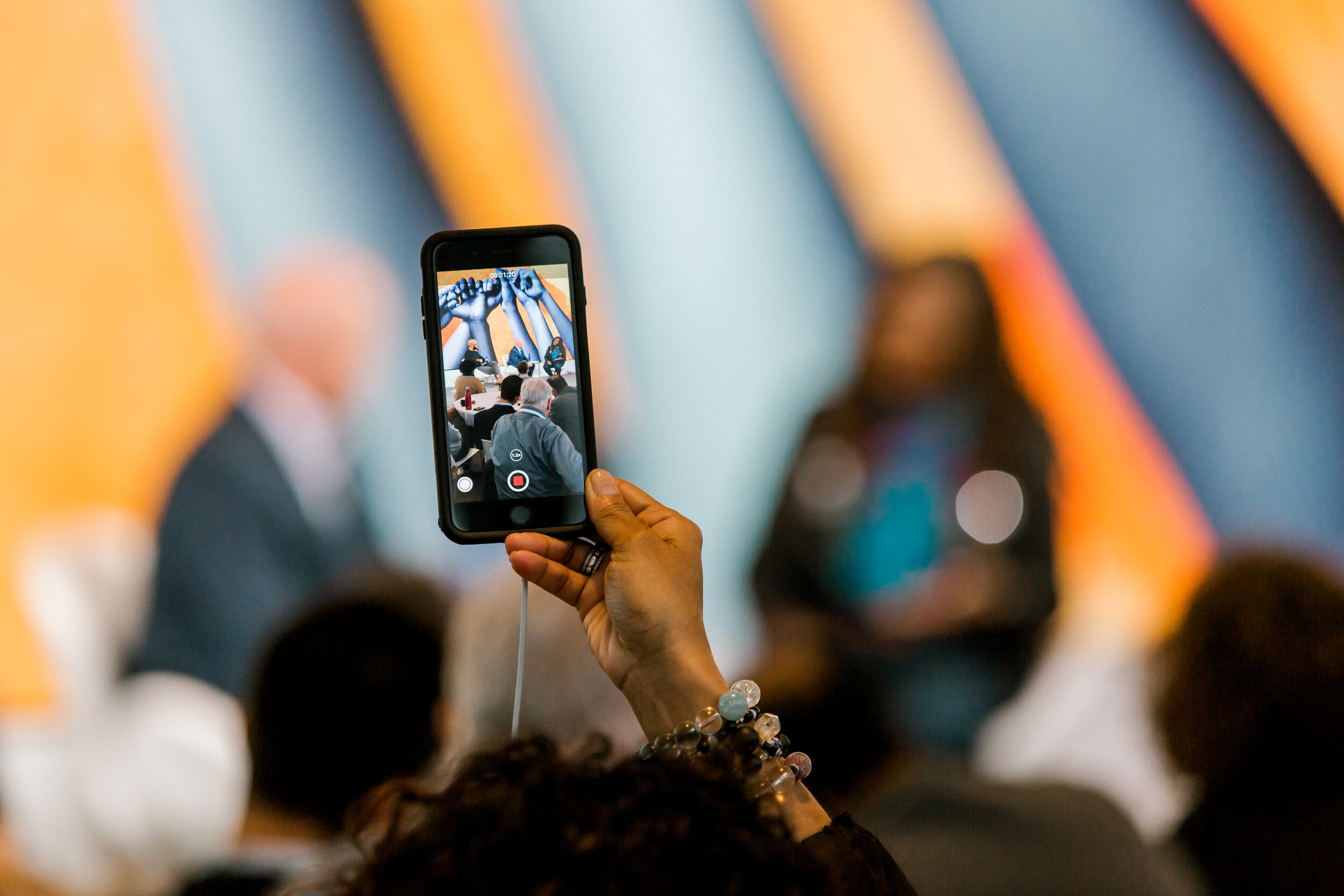
Environmental & Event Design
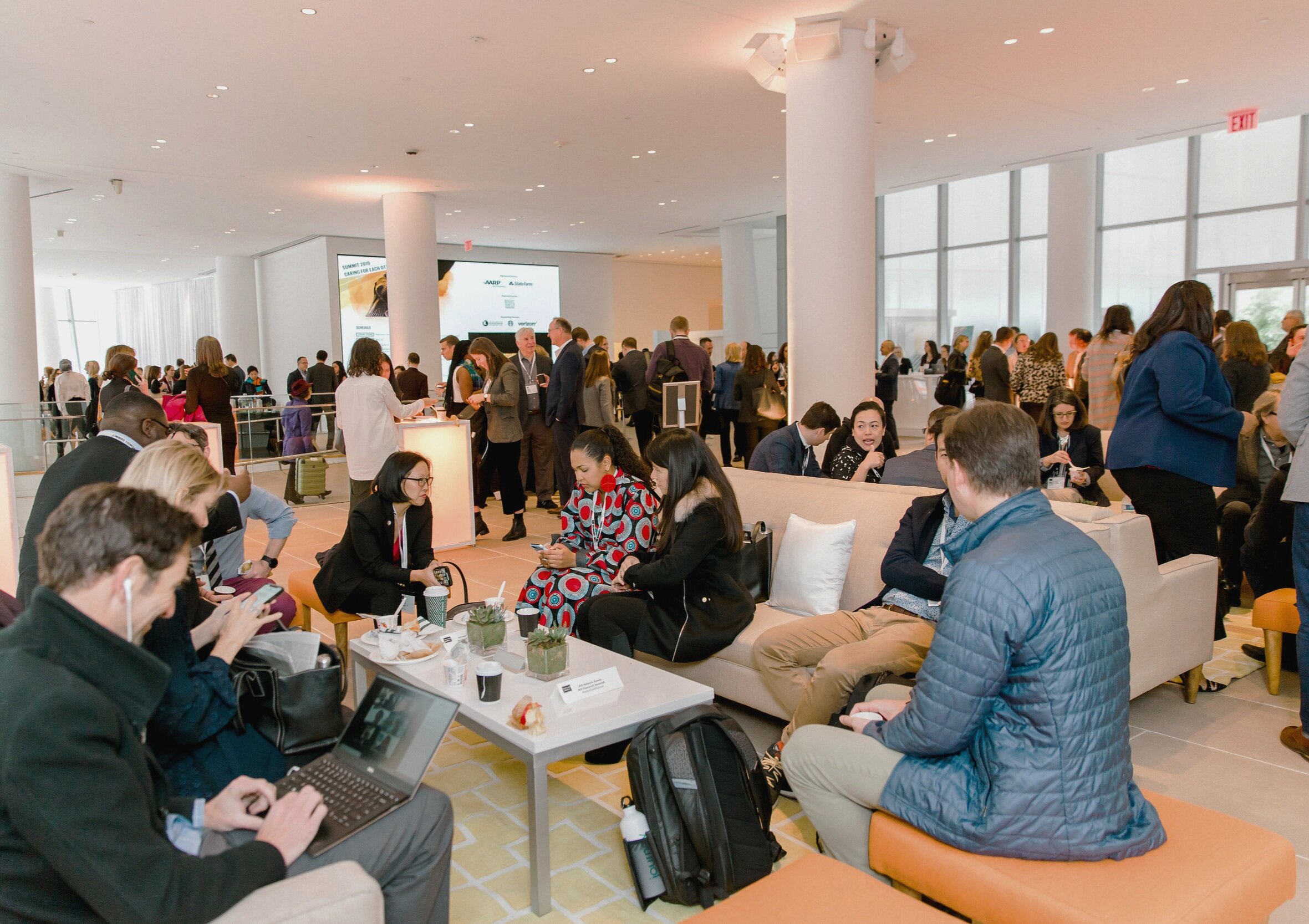
NationSwell hosts two international Summits every year. Each event hosts a diverse, inclusive group of 350+ leaders from the public, private, social, and grassroots organizations.
As Creative Director, I lead the Identity Design for the event and collateral system for use across environmental, digital, social, and swag.
How it started
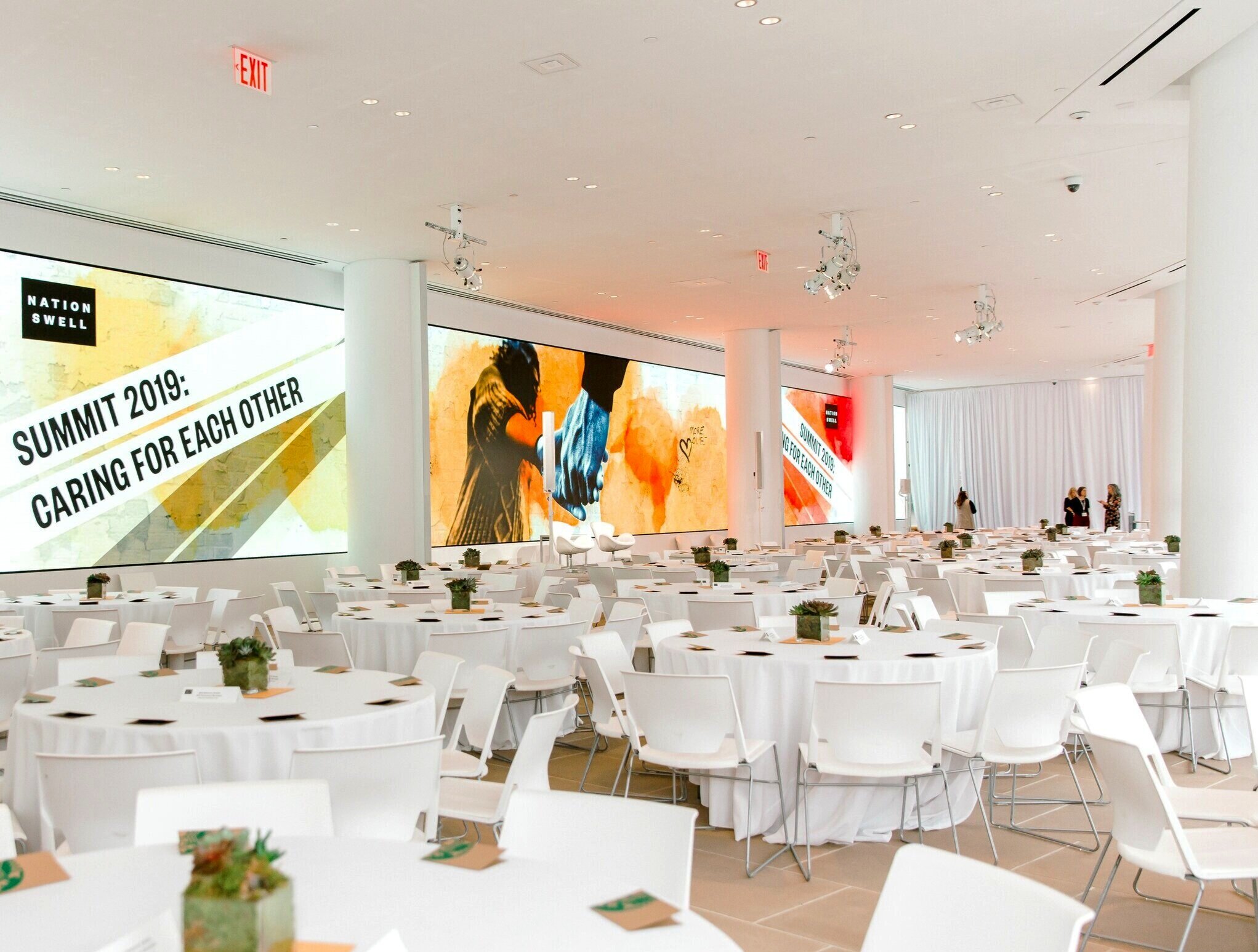
Most recently, Summit East’s theme was “Caring For Each Other". In an era of hyper-partisan politics and divisive rhetoric, this event took a proactive look at how a more caring, inclusive society could be created from the grassroots up.
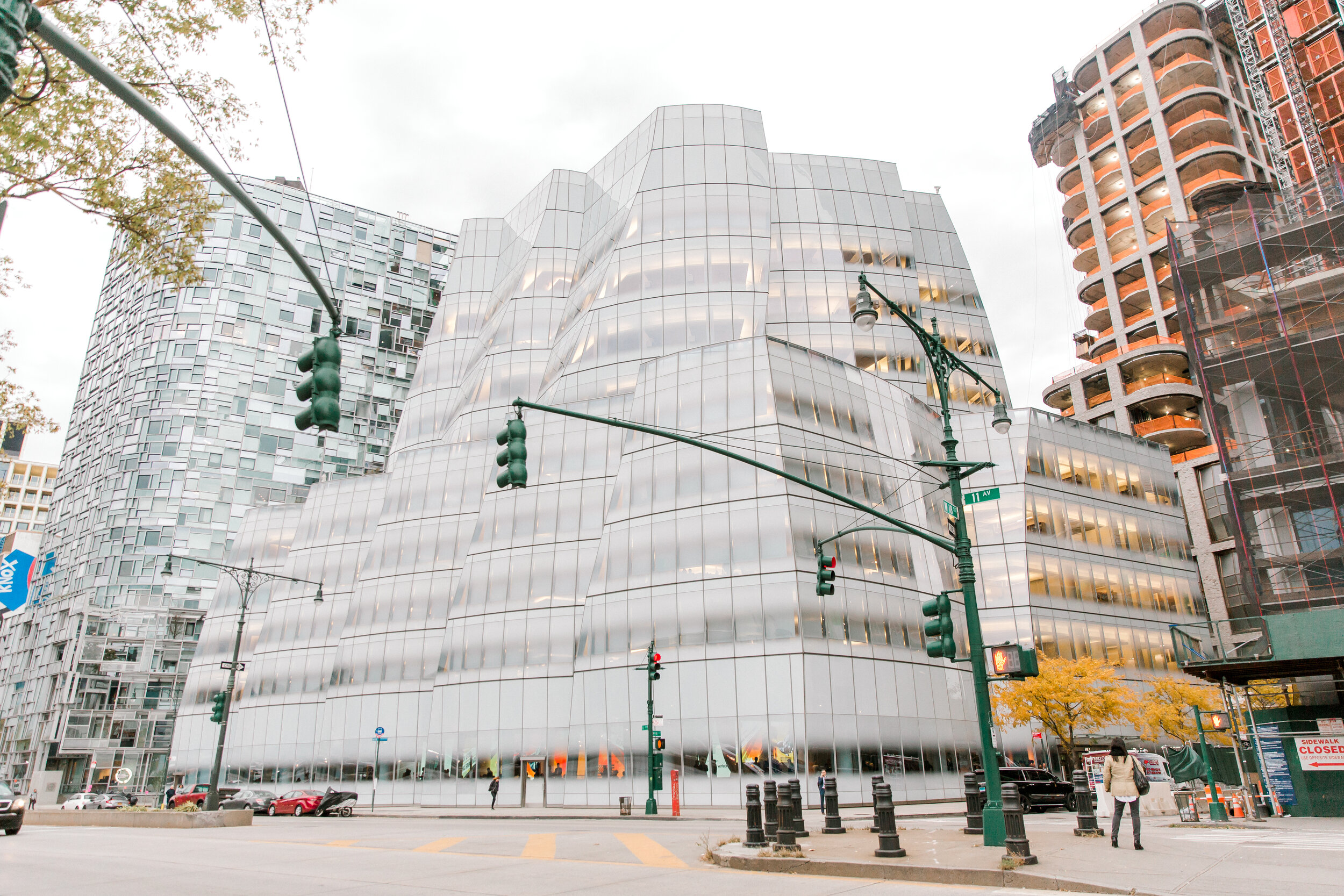
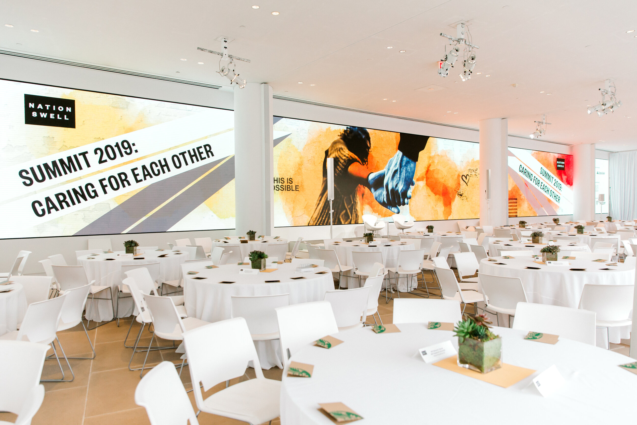
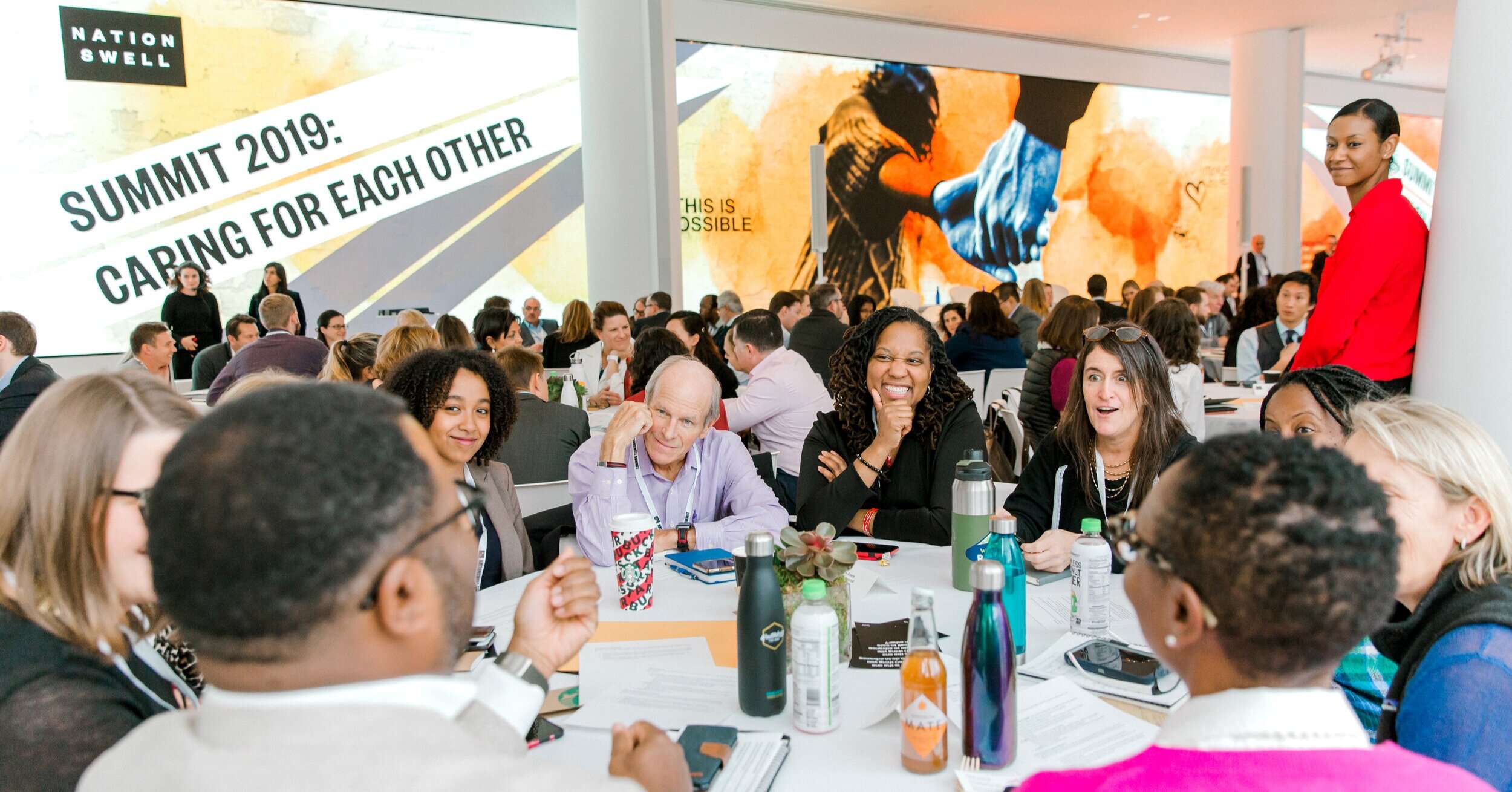
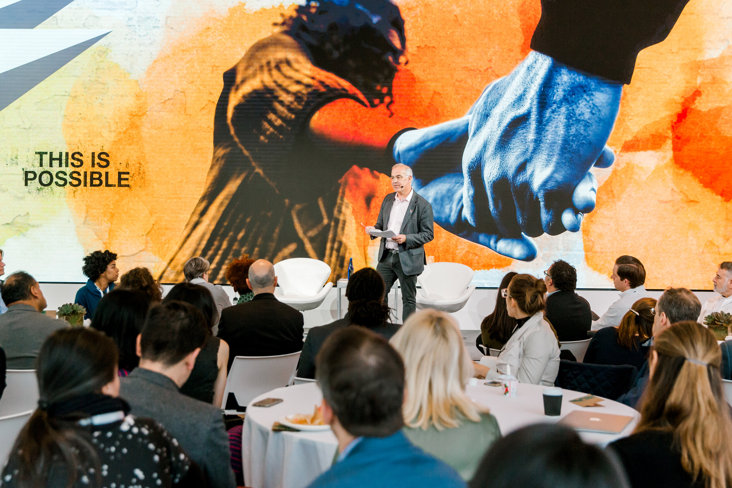
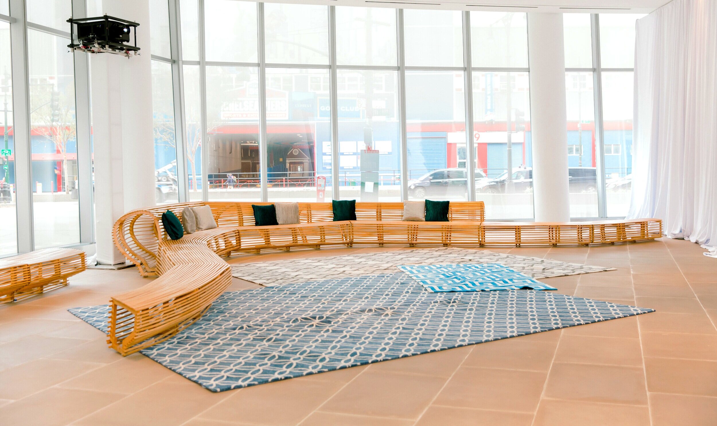
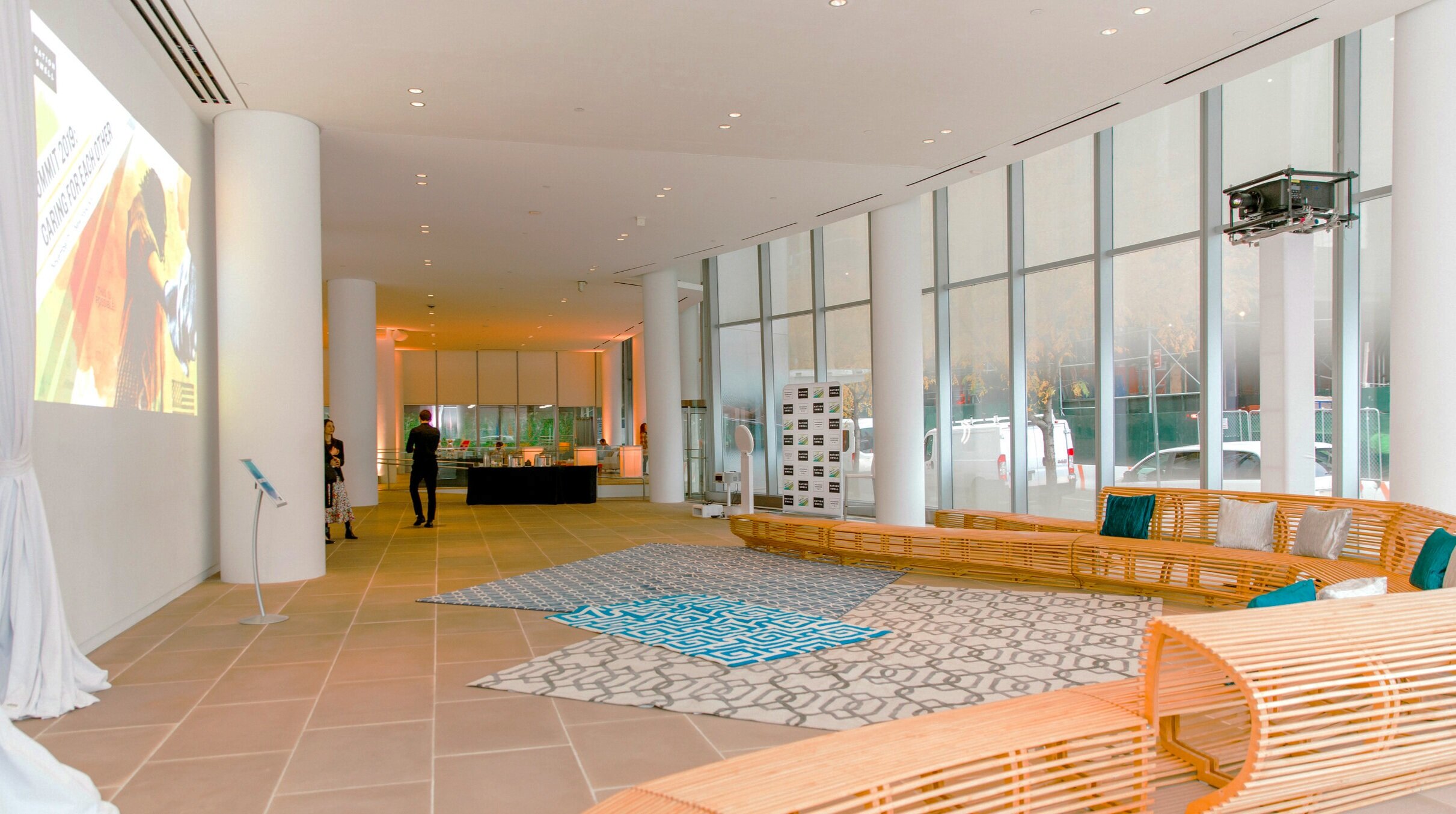
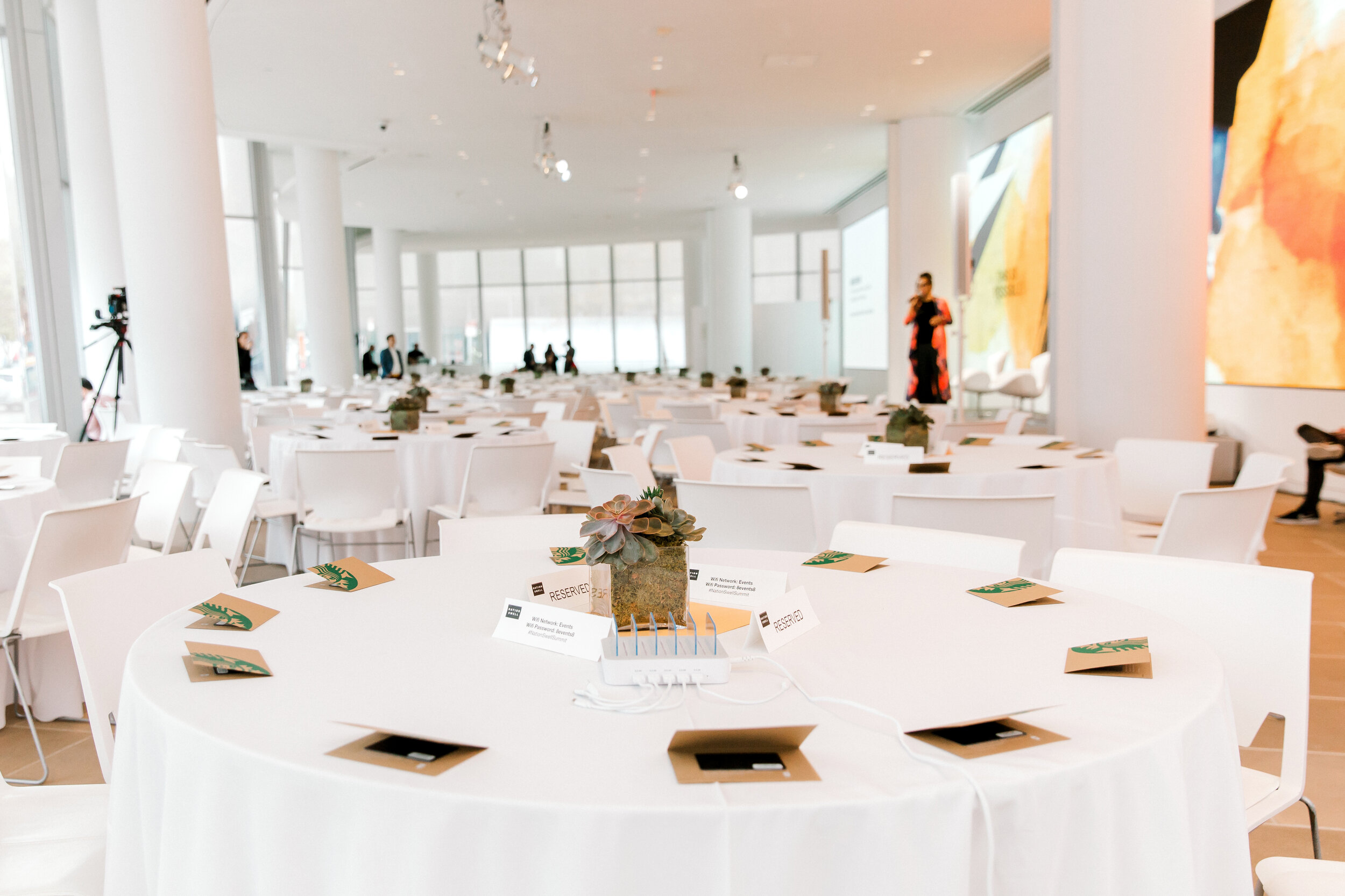
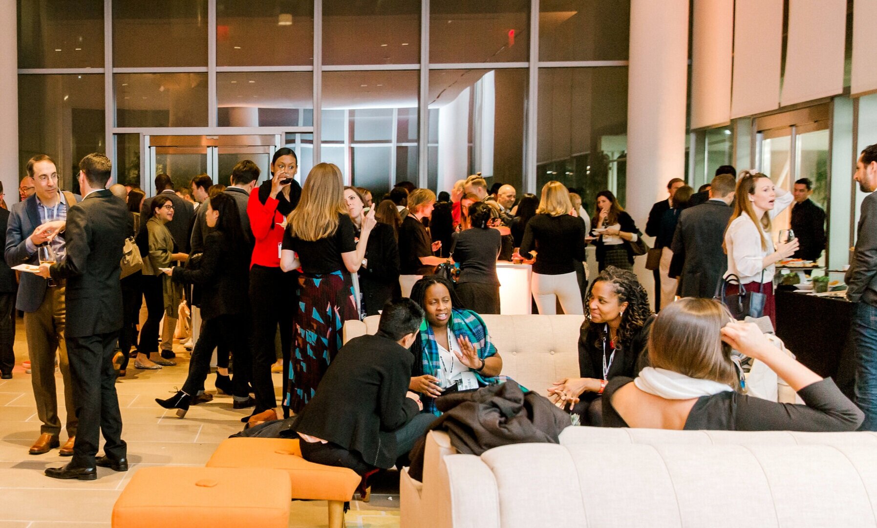
Design needed to lift phrase “Caring For Each Other” and give it a more dynamic identity. Caring can feel soft, but the work is gritty, hard, and bold. This was particularly important in the context of the event location. Held at the Frank Gehry-designed IAC Building in New York, the space was almost entirely white and glass.
The inspiration
The design inspiration came from the streets and walls of Leith, Edinburgh. Leith is on the outer edge of the city, near the city’s shipyards.
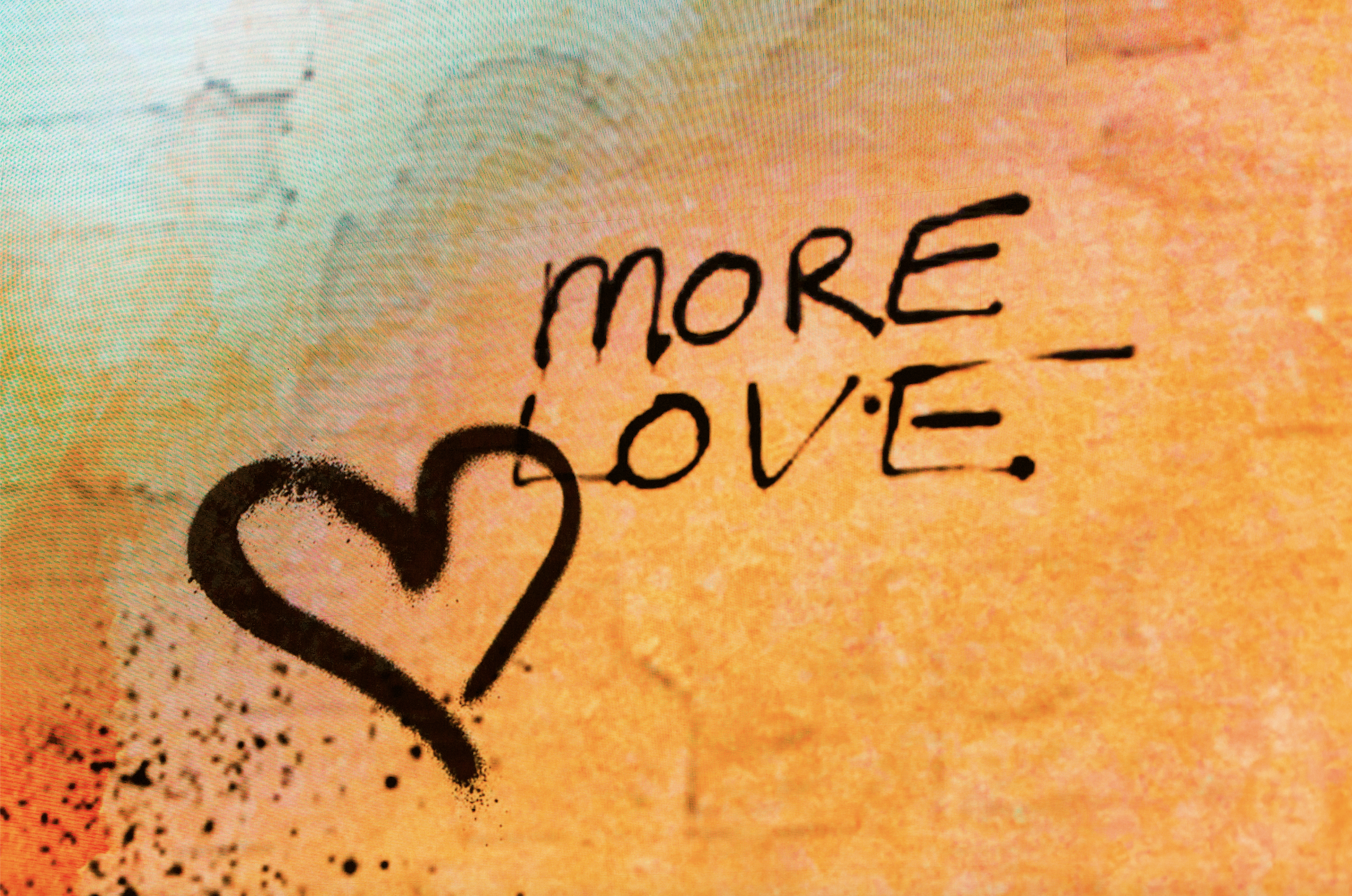
It’s rough around the edges and its working-class history can be seen in the upstart phrases tagged on city walls. There’s also a gentle elegance that comes from the water, the green spaces, and historic buildings.
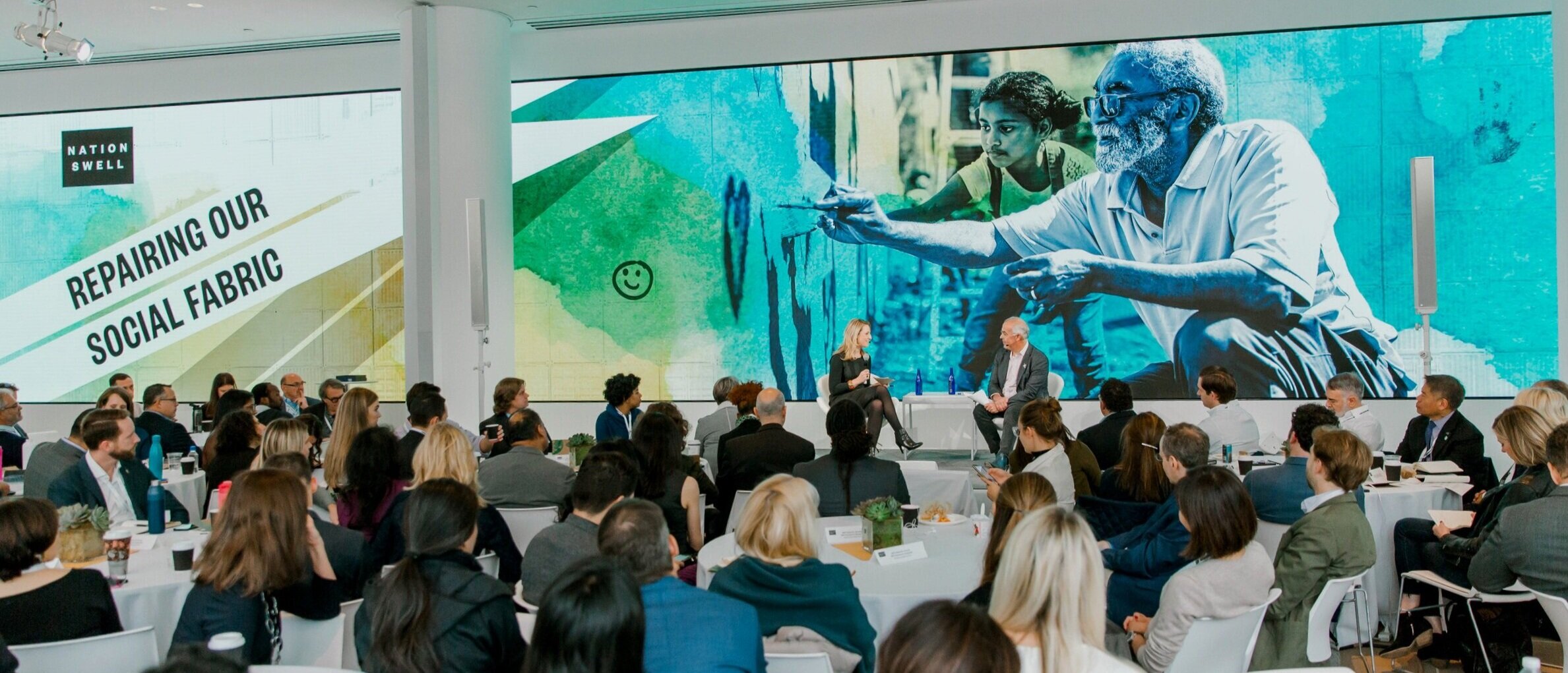
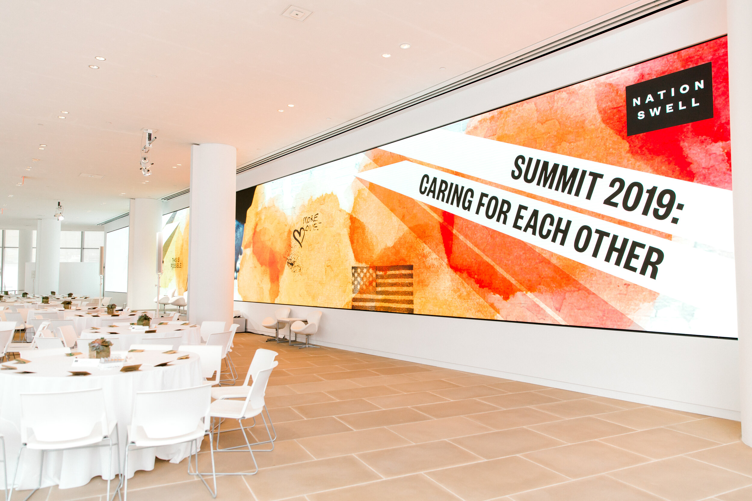
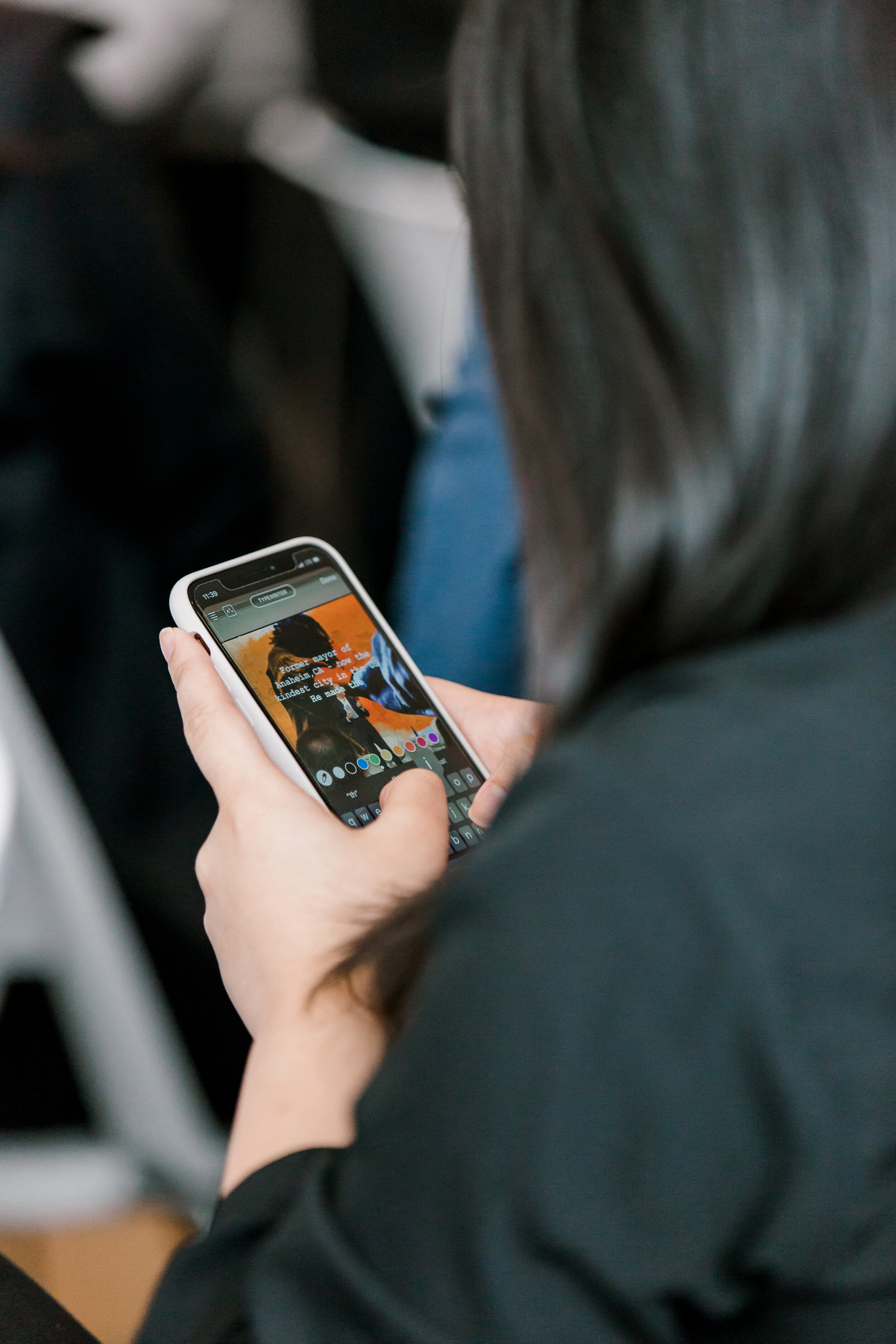
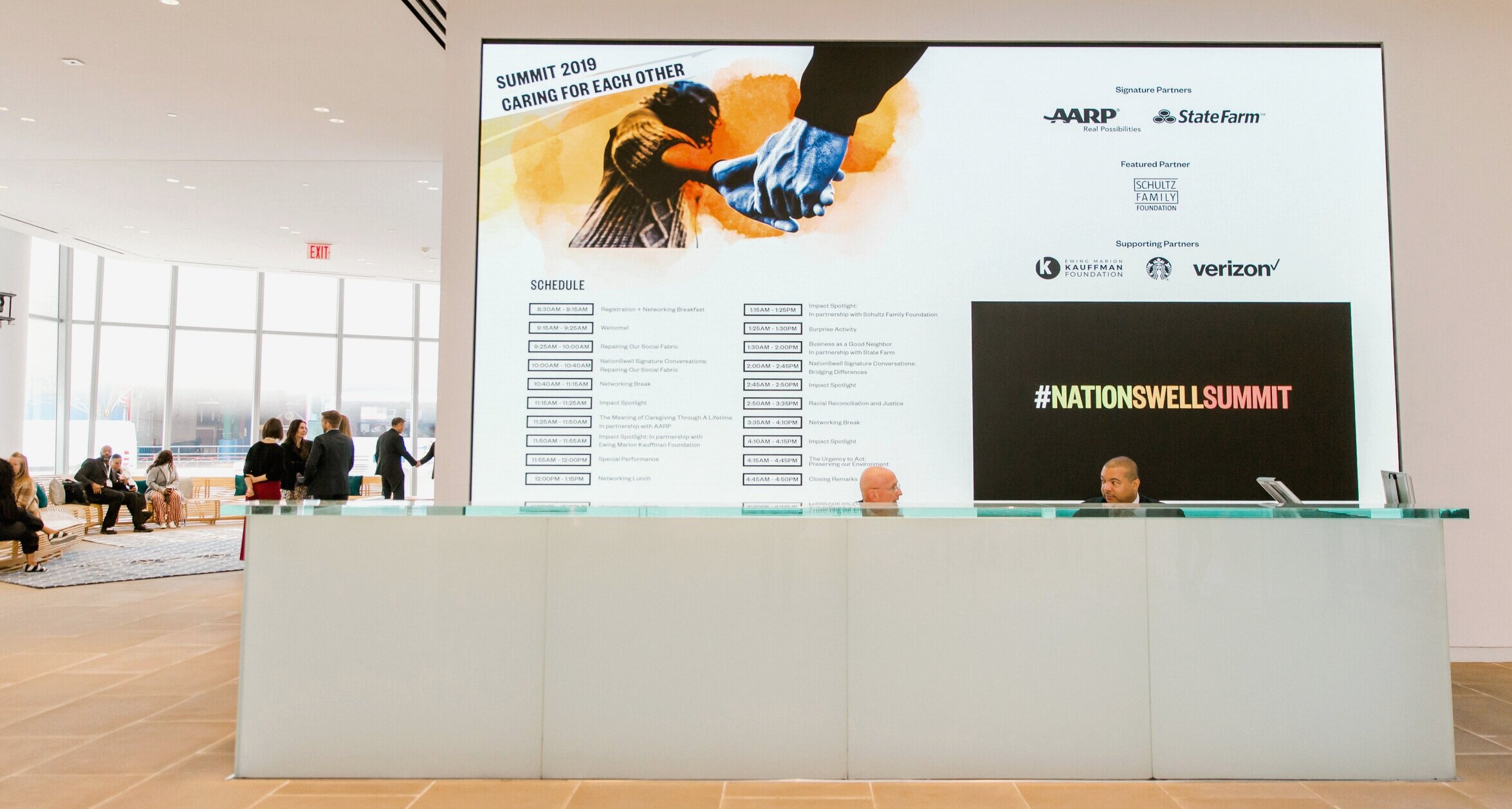
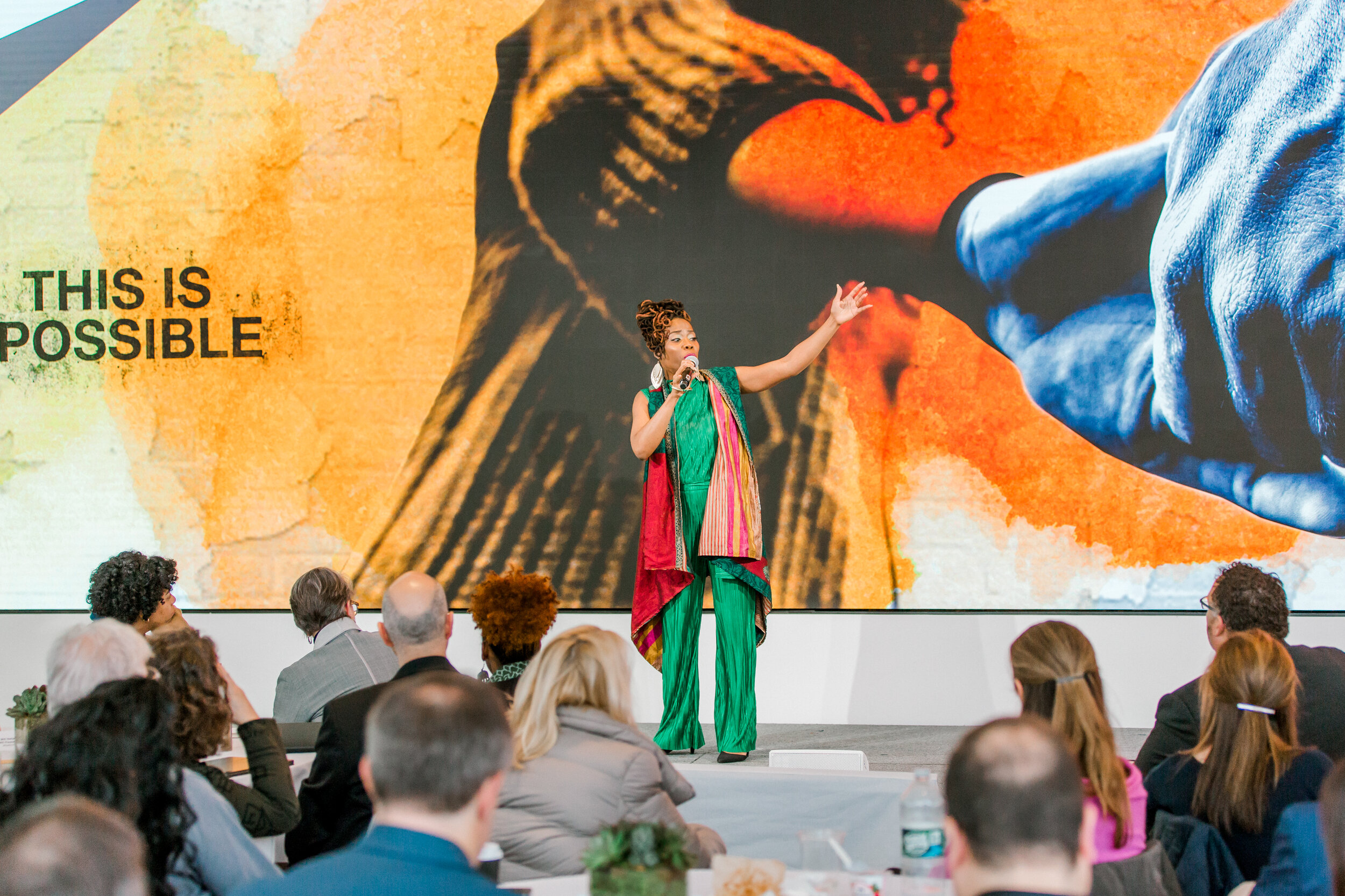
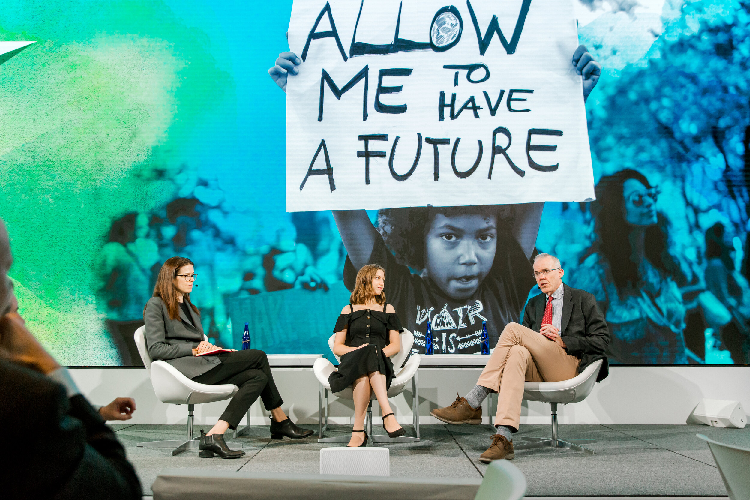
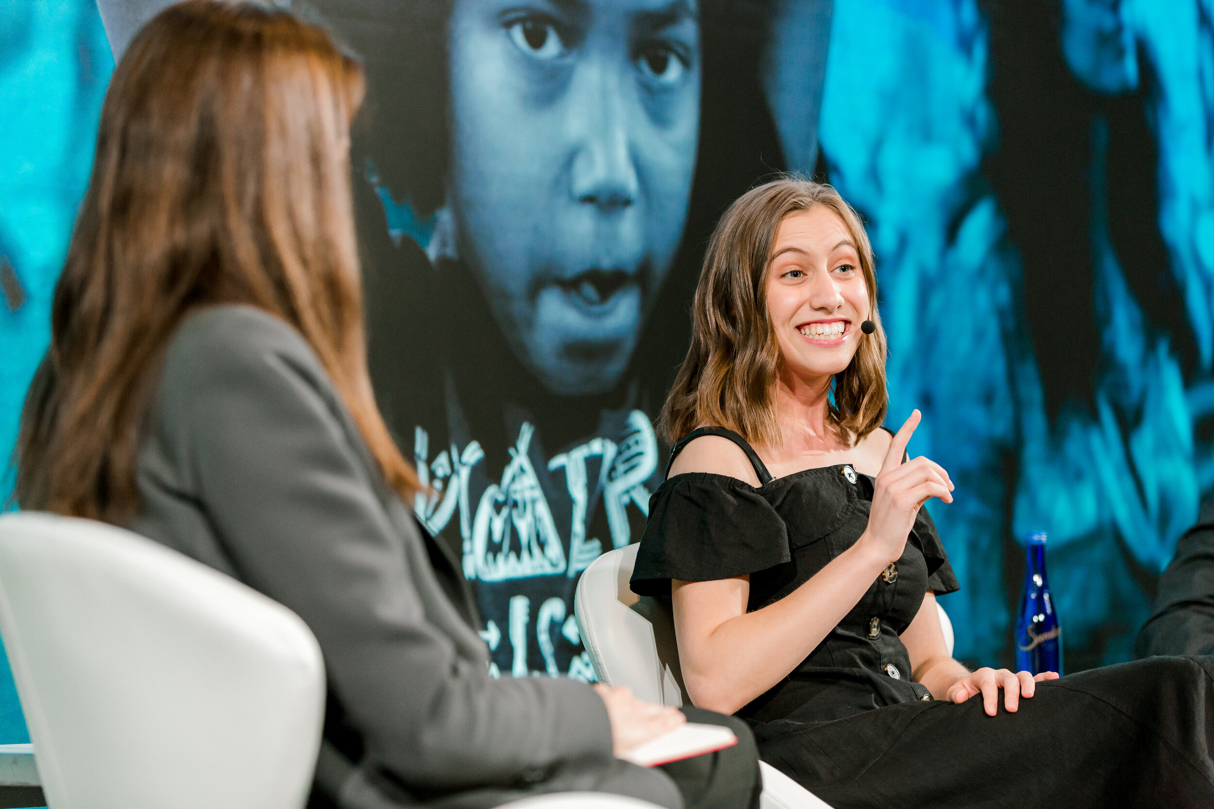
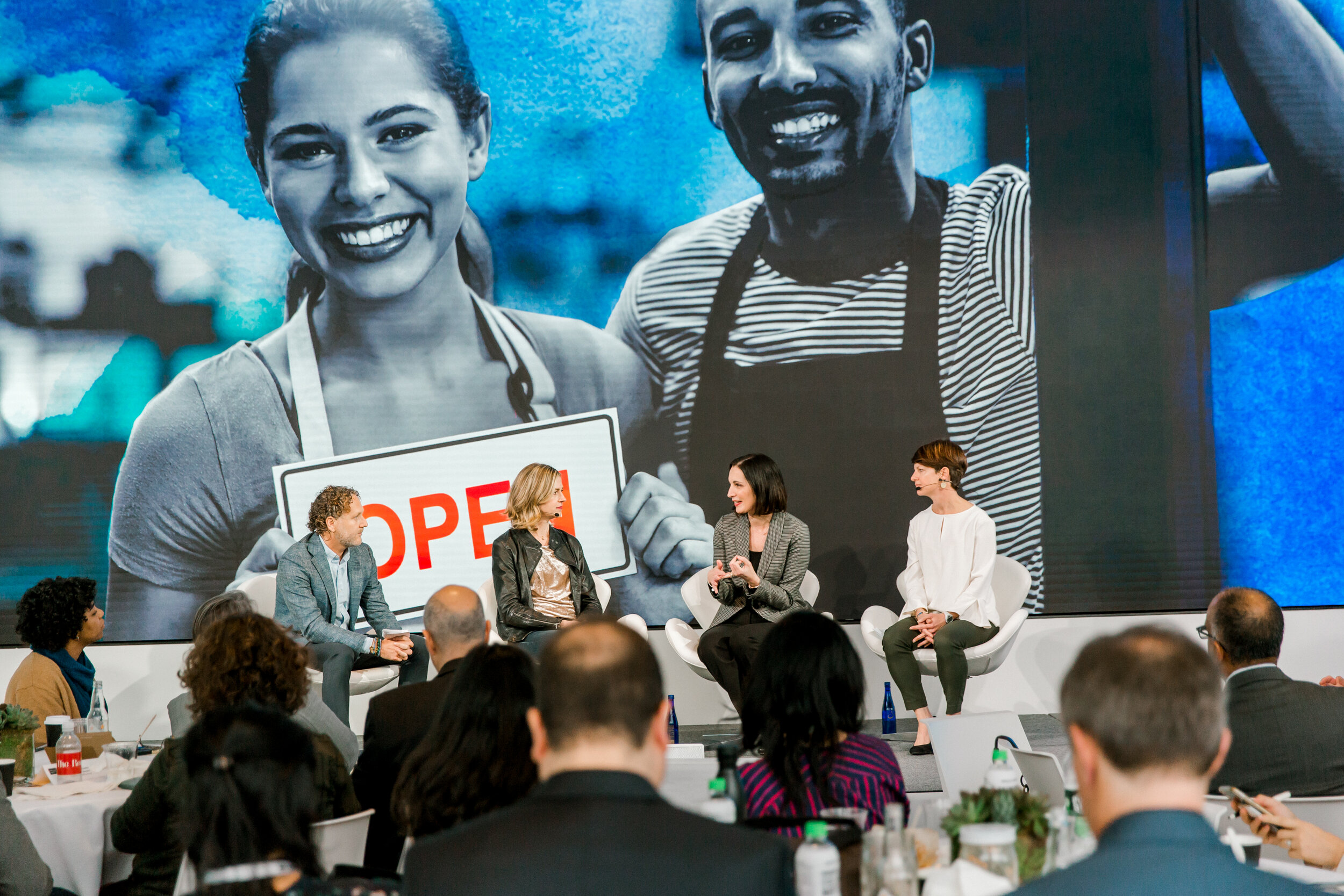
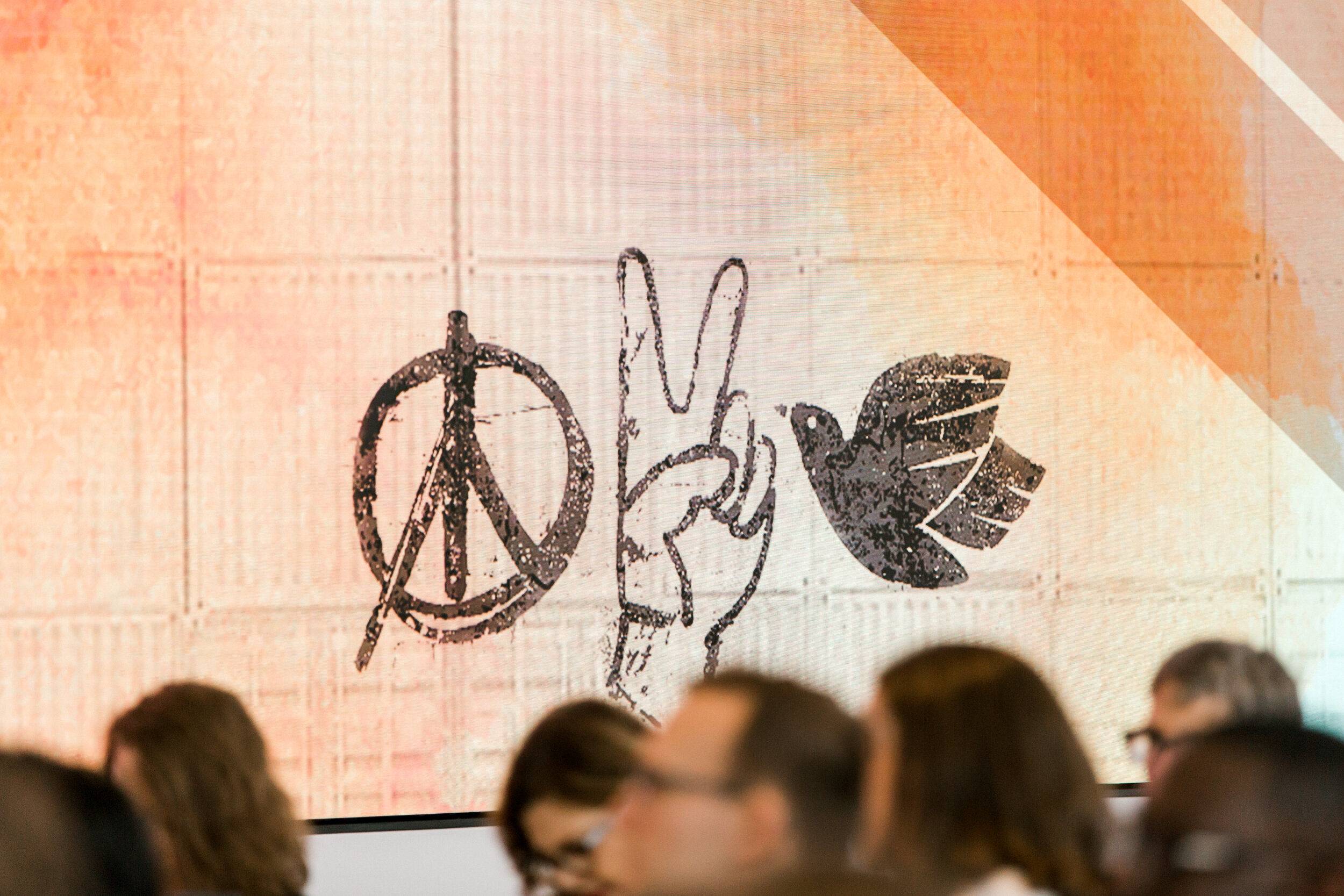
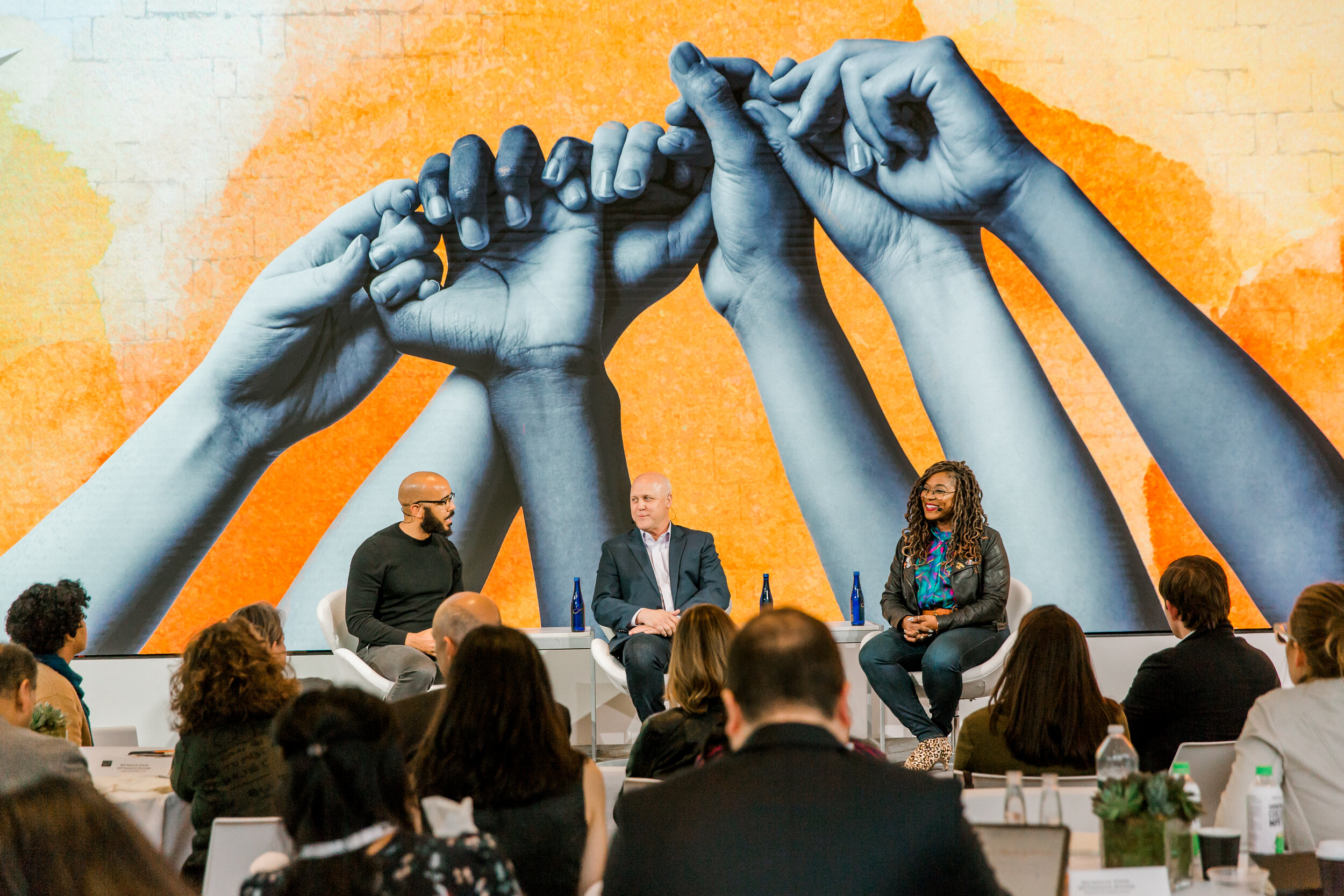
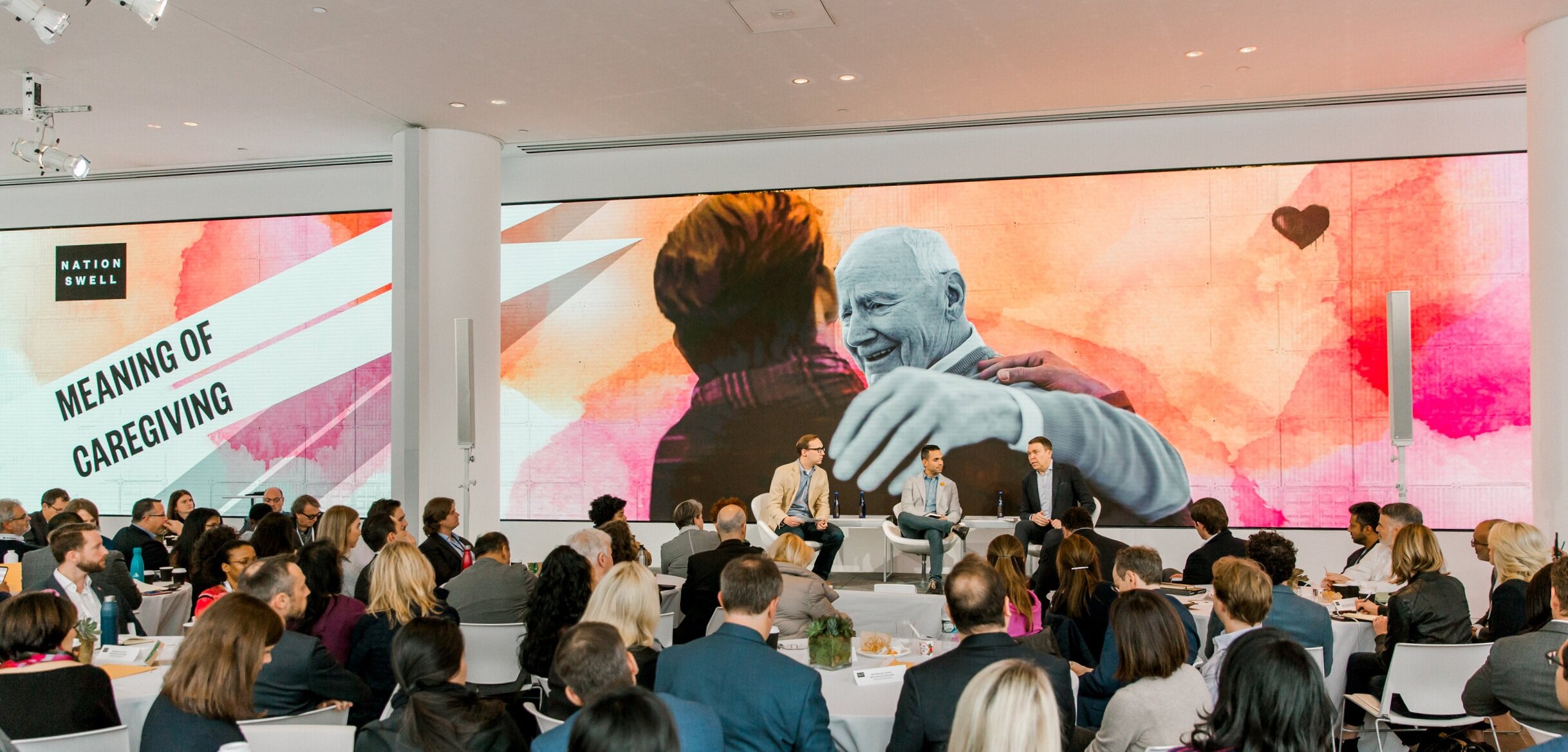
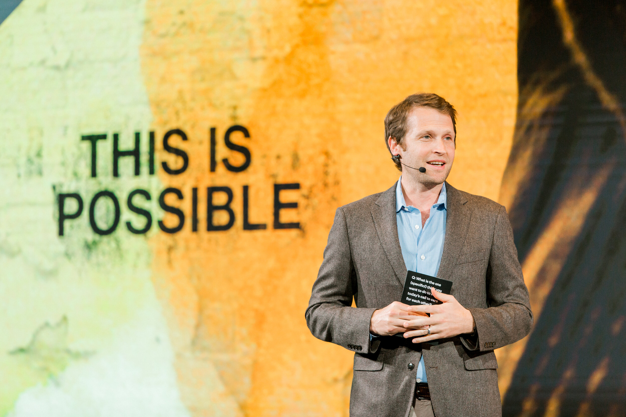
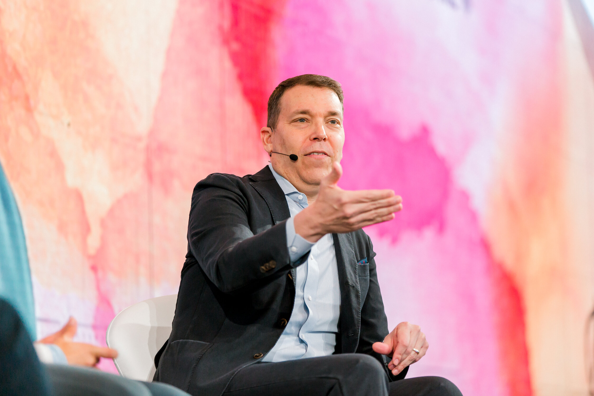
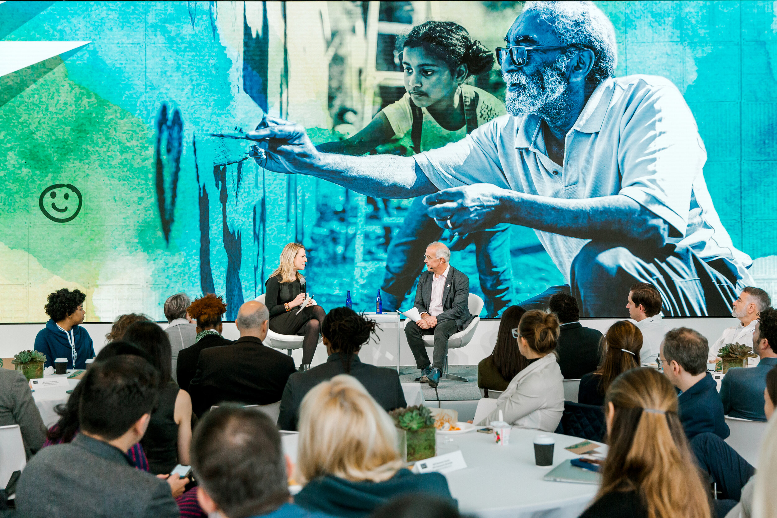
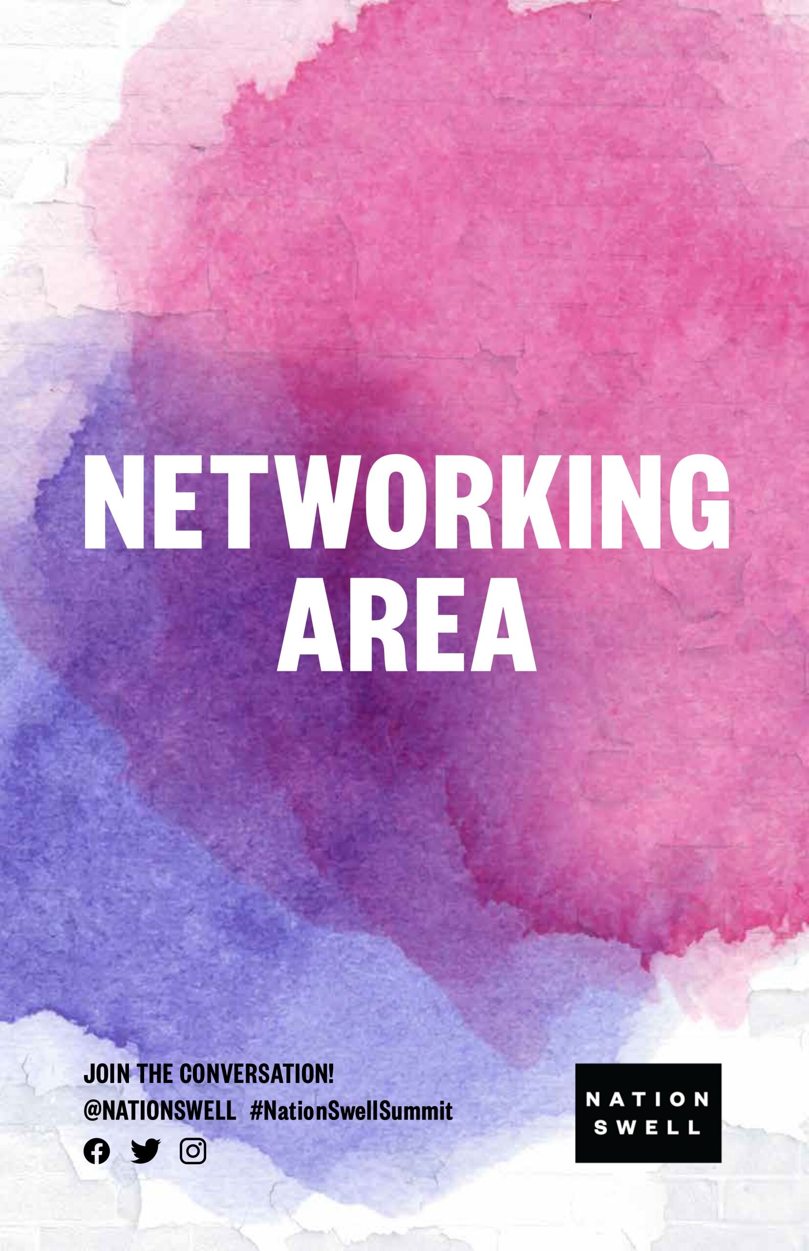
This delicate balance was the starting point for Caring For Each Other’s visual system. There are bold watercolor washes, reminiscent of the elegance of watercolor painting, but also of spray paint. The large text claims sections of the space. Inclusive images were washed with color - but one, central image was left in black and white to draw in the audience's eye. “Subversively Positive” graffiti flourishes would build out the identity, meaning any tagged image had to be irreverently hopeful and gritty. You’ll see phrases like “This is possible” and stencils of olive branches or doves sprayed on the walls.
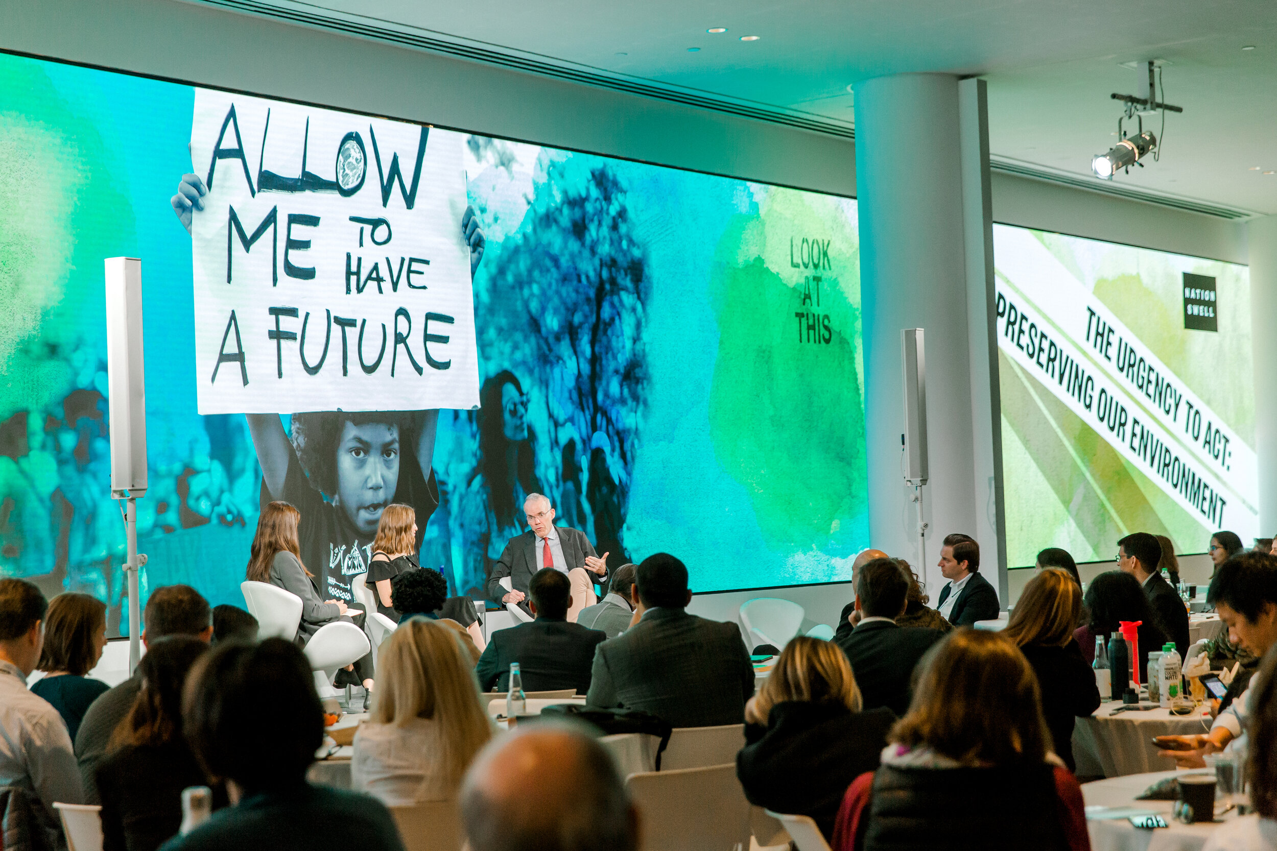
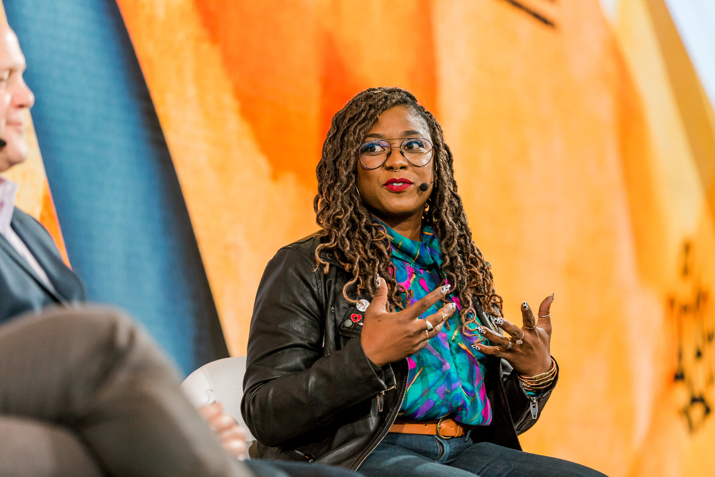
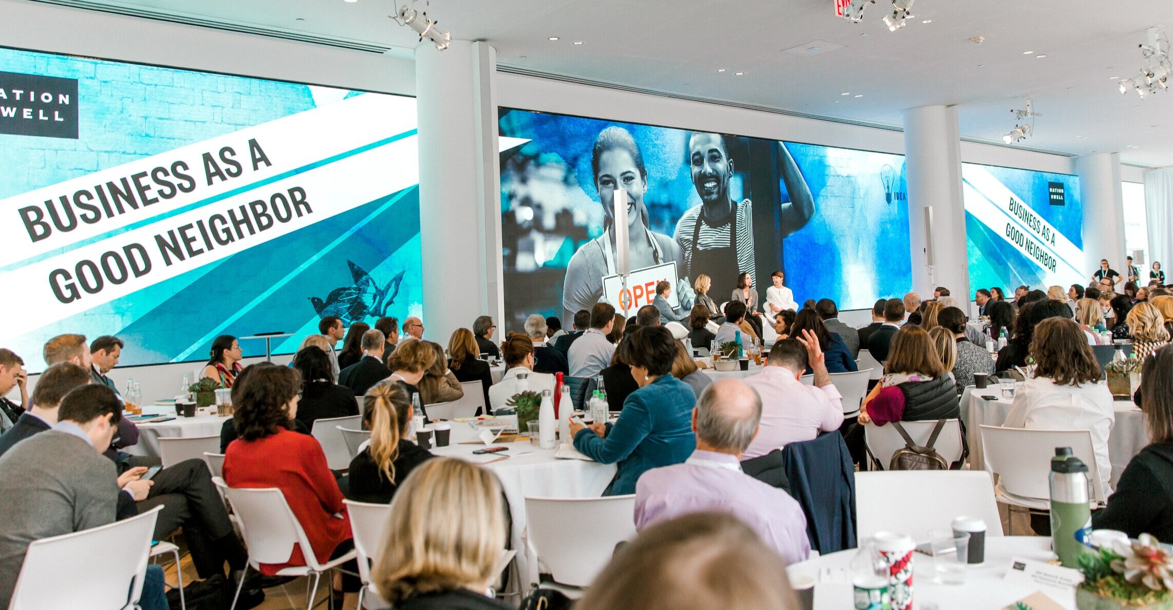
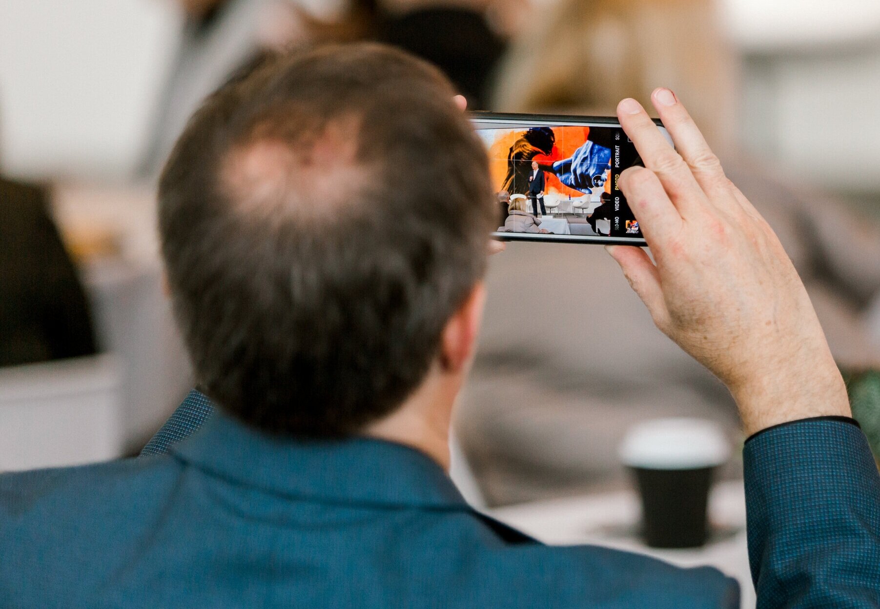
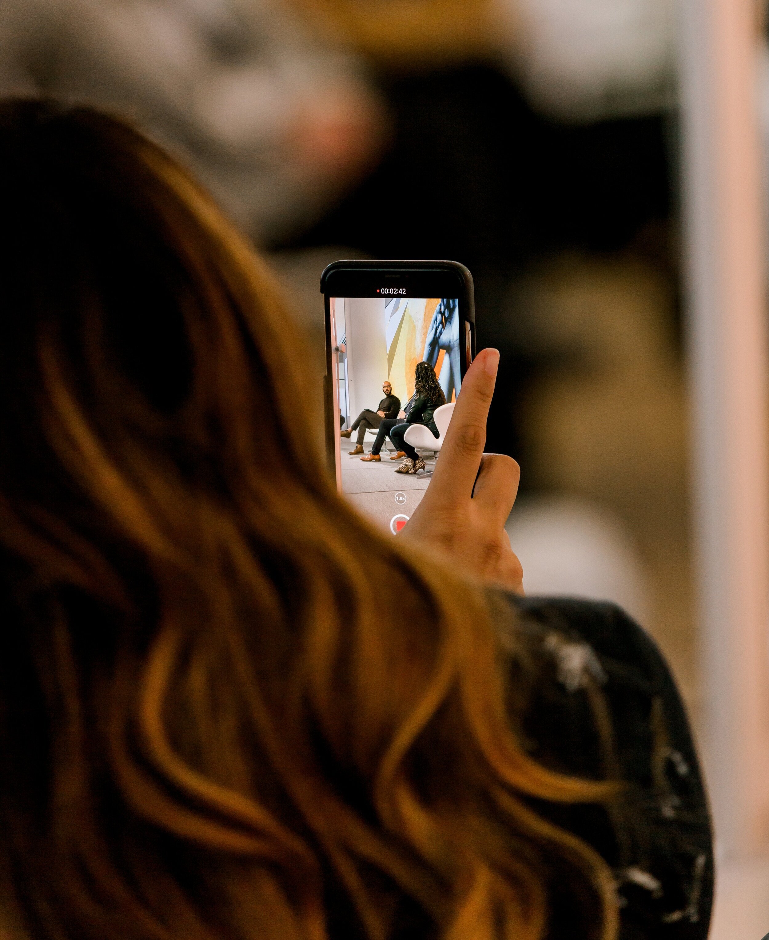
The mainstage images stretched across an enormous digital screen, measuring 120 feet (37 m) wide and 11 feet (3.4 m) high. Each custom panel background was designed to photograph in a wide shot and close up (encouraging social shares), and offering a quality visual no matter where your seat in the room.
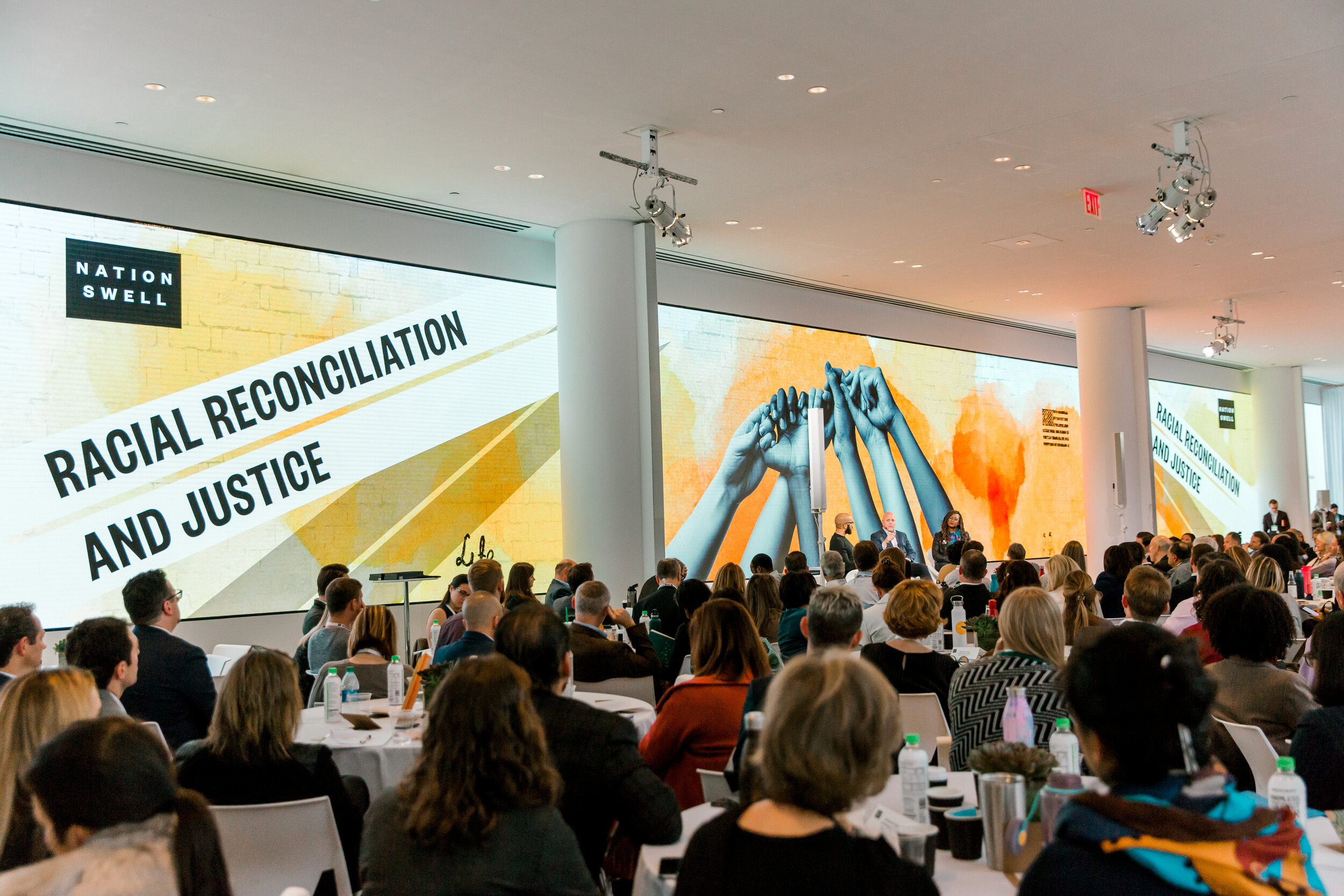
The main stage designs stretched across an enormous
digital screen, which measured 120 feet wide
by 11 feet high (37m by 3.4m).
Seven custom panel backgrounds were designed to illuminate the room in color, photograph beautifully in both a wide shot and close up (encouraging social shares), and offer audiences quality visual experiences at every seat in the room.



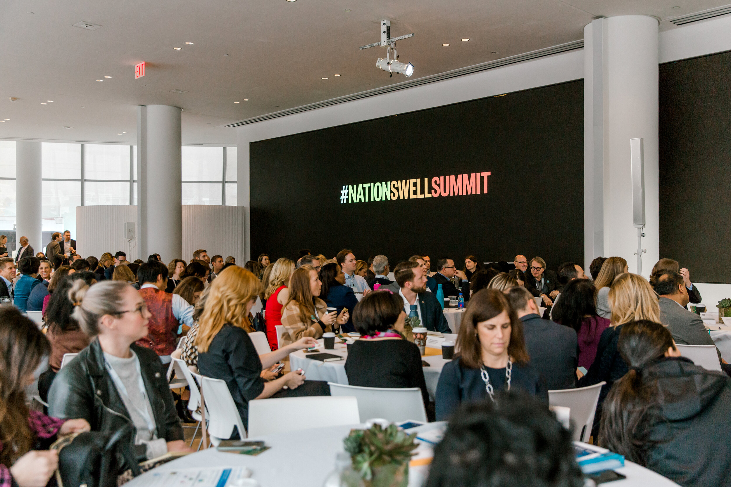
Collateral system & staging
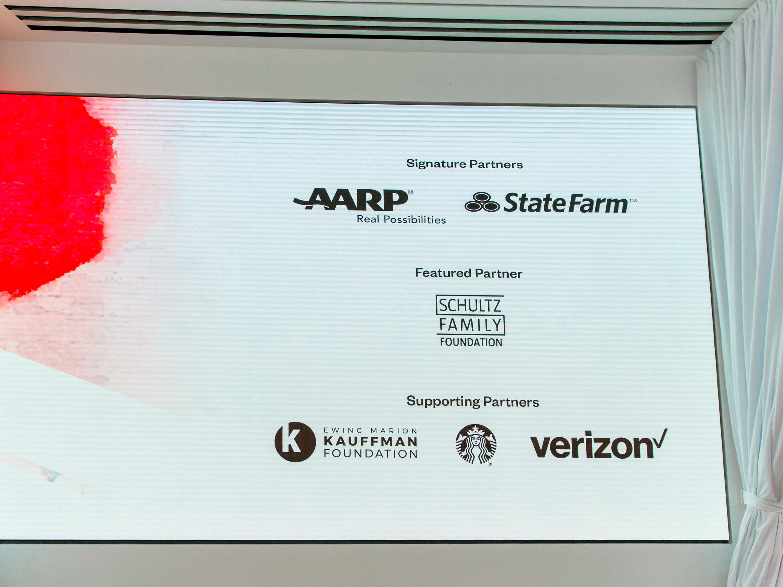
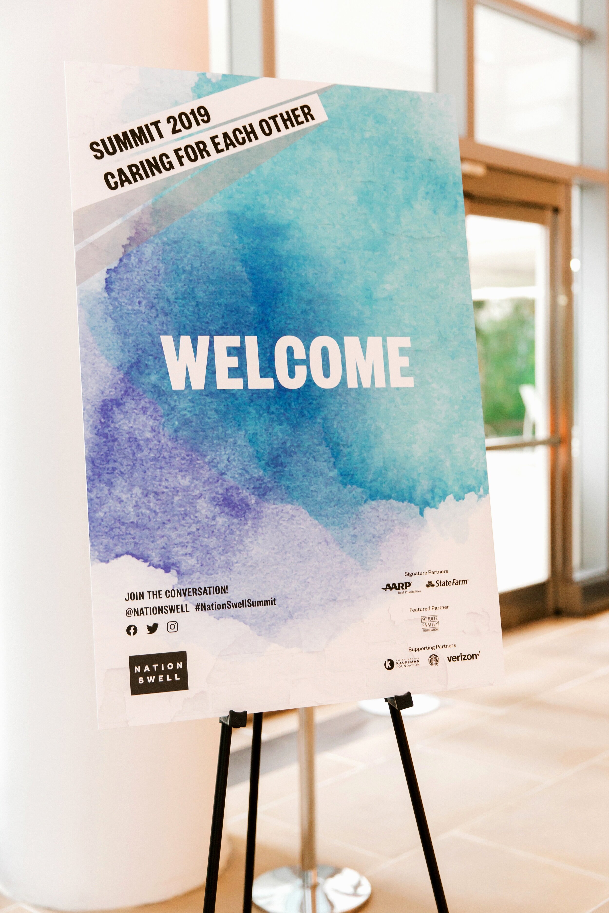
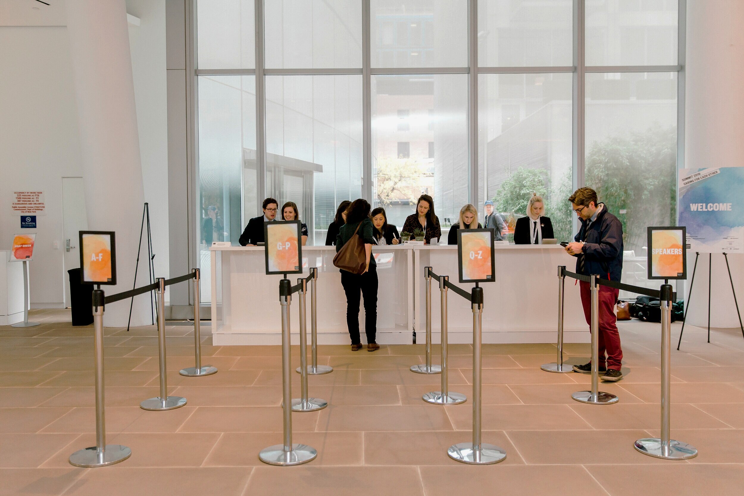
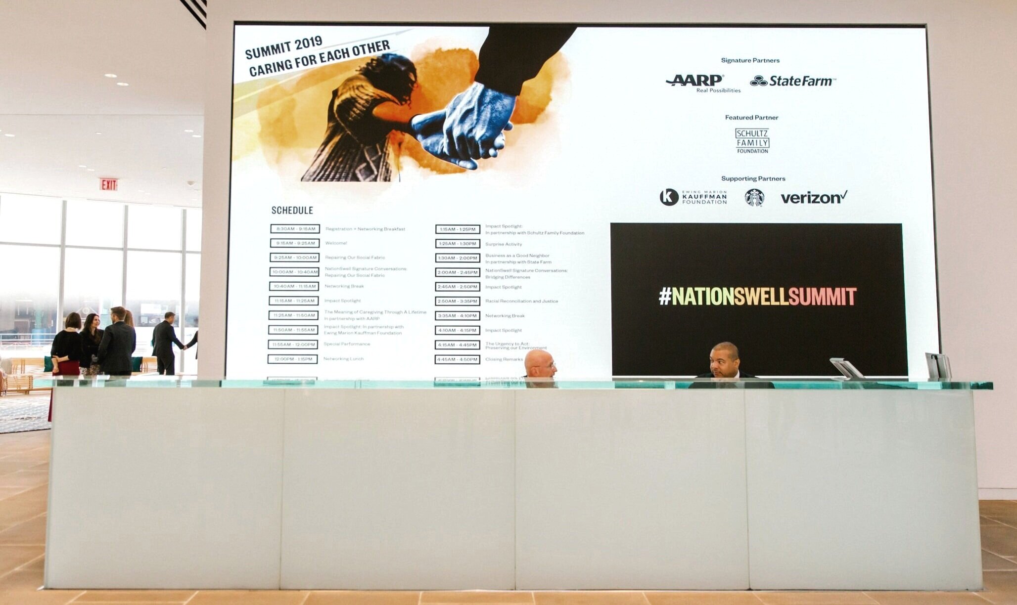
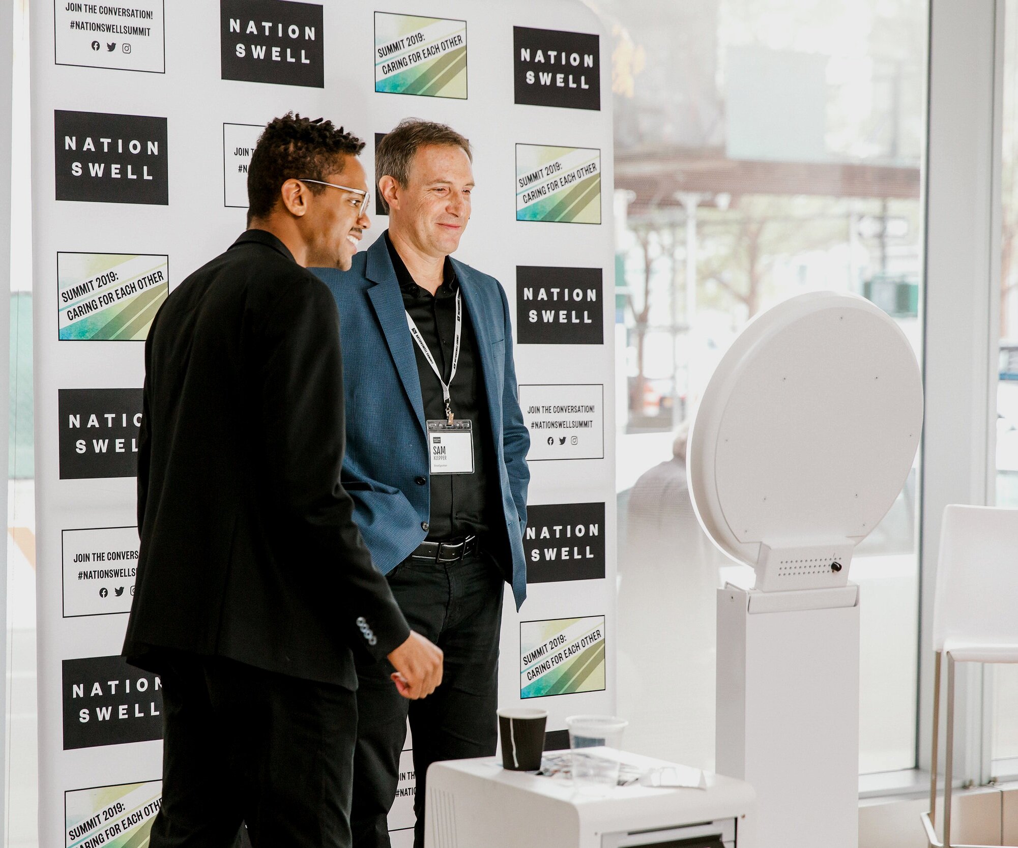
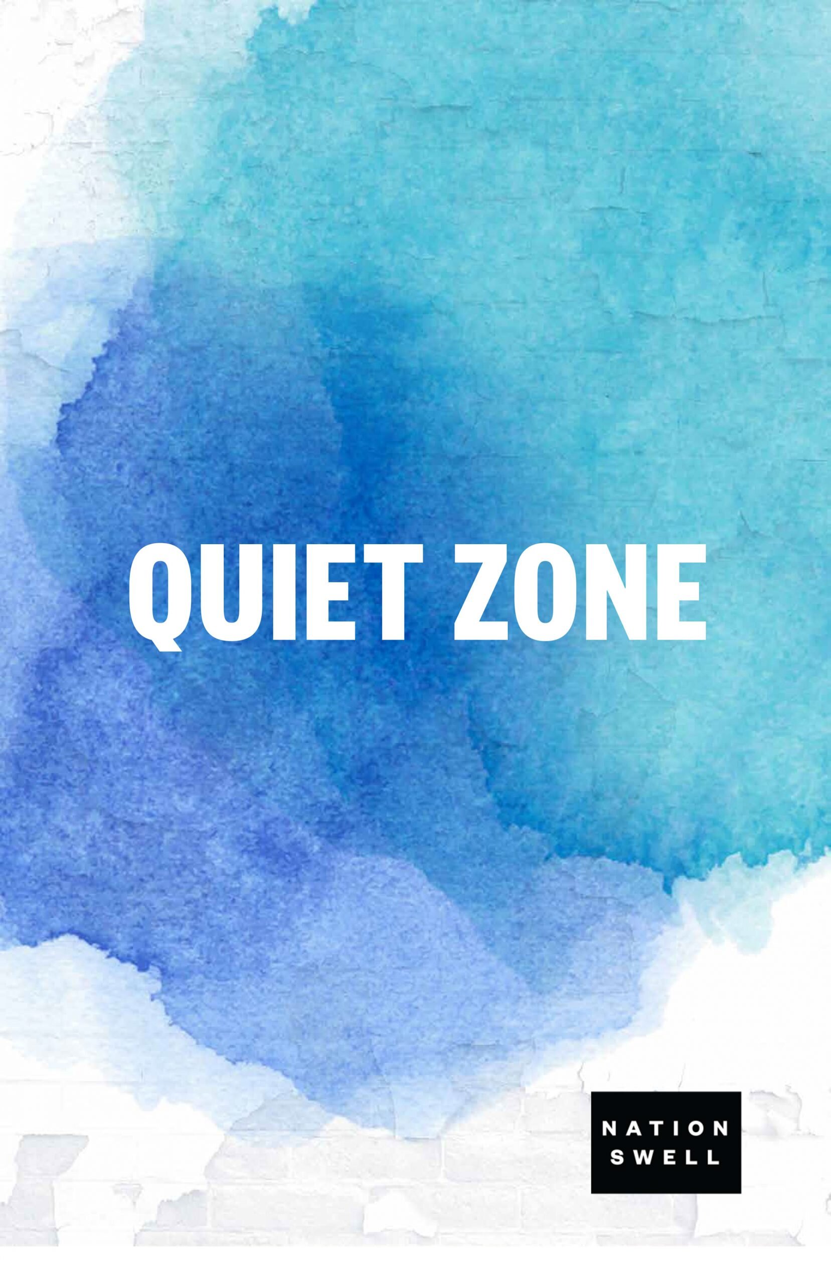
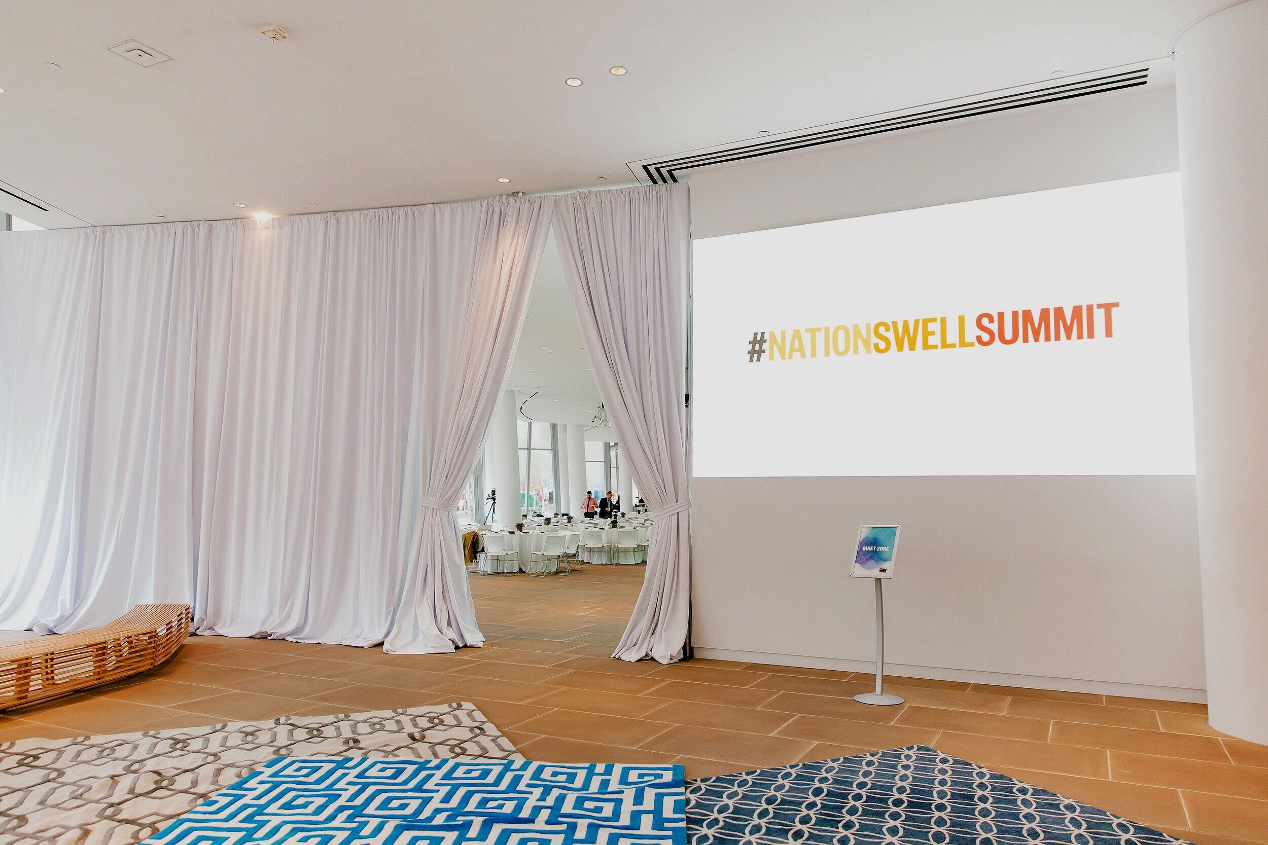
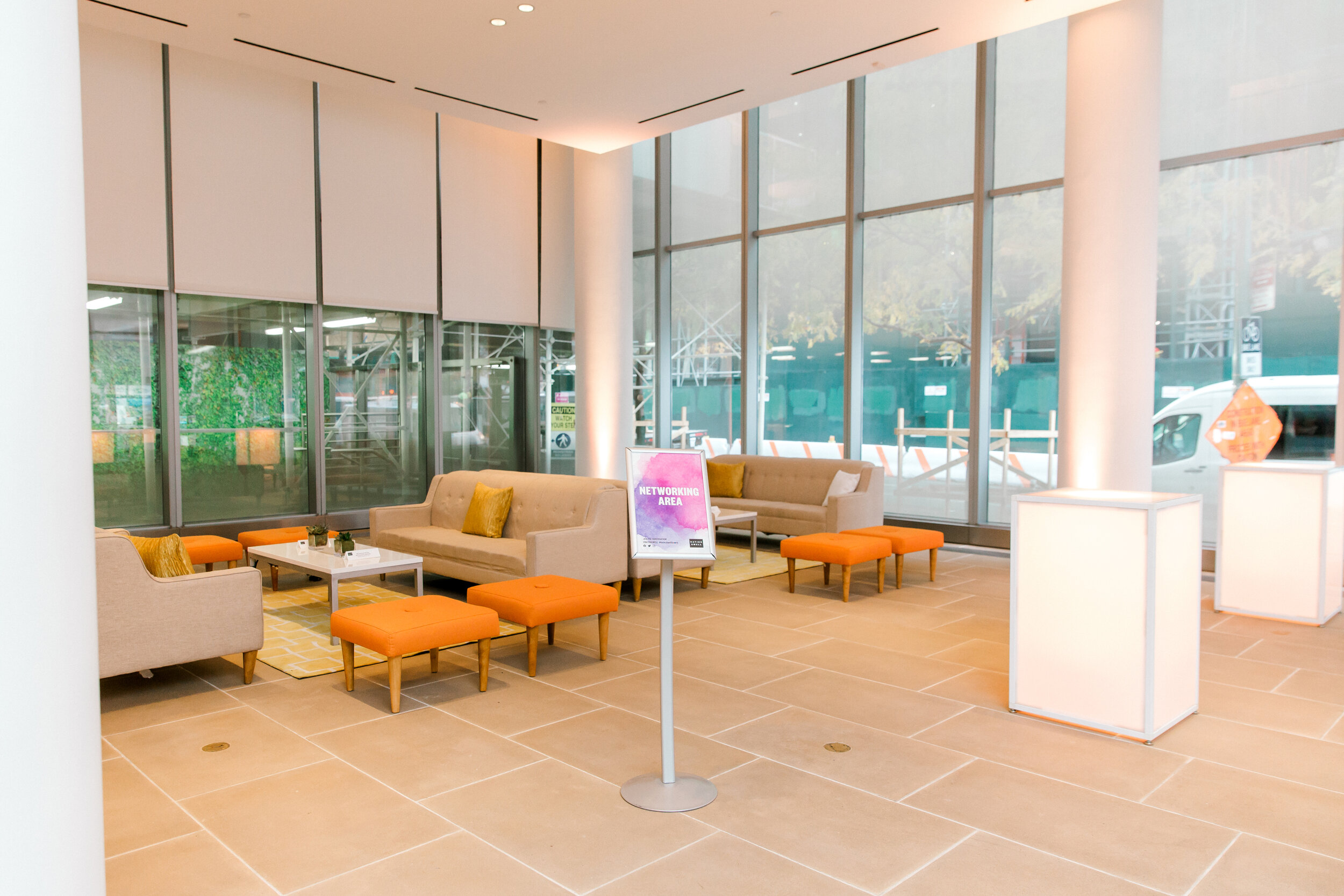
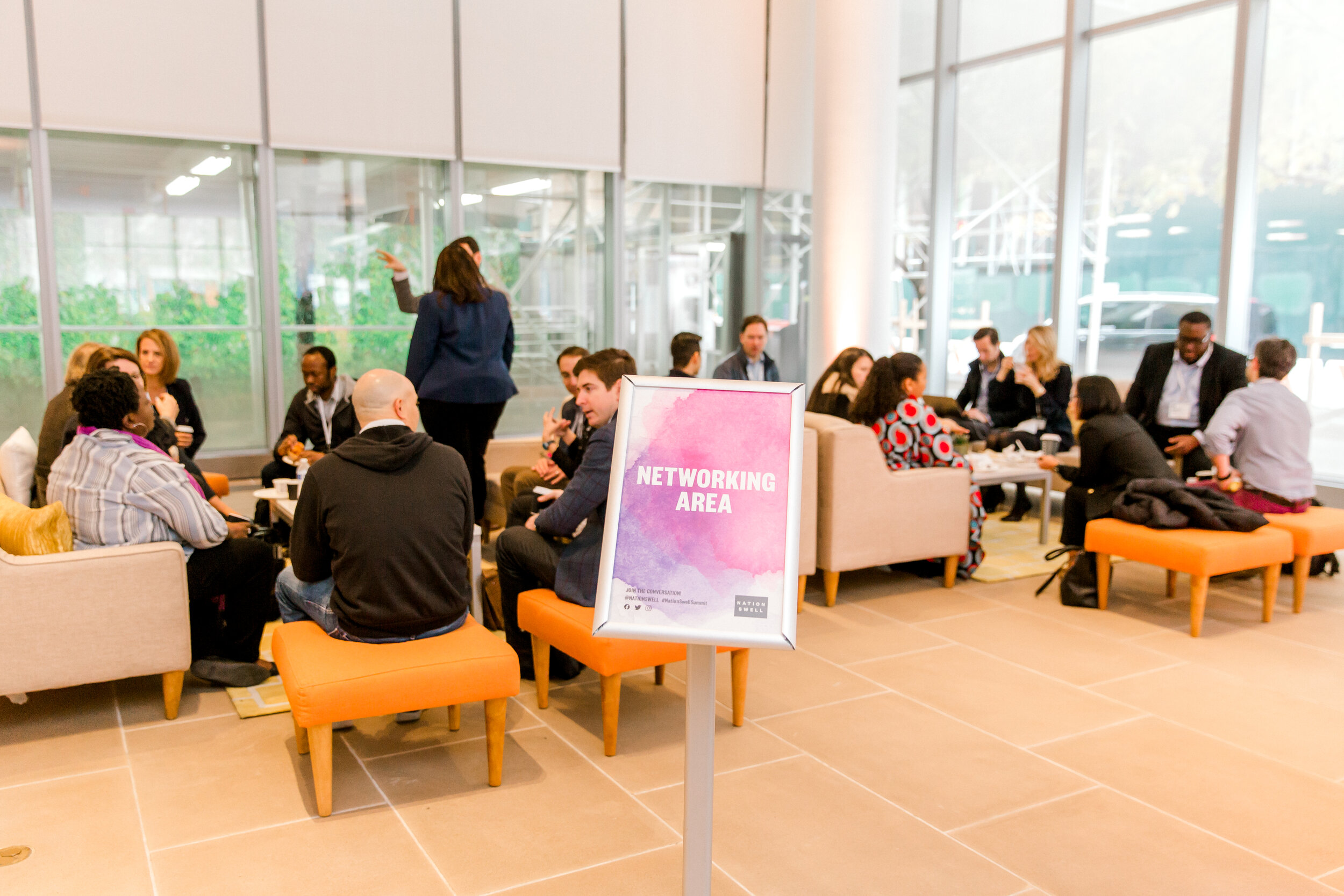
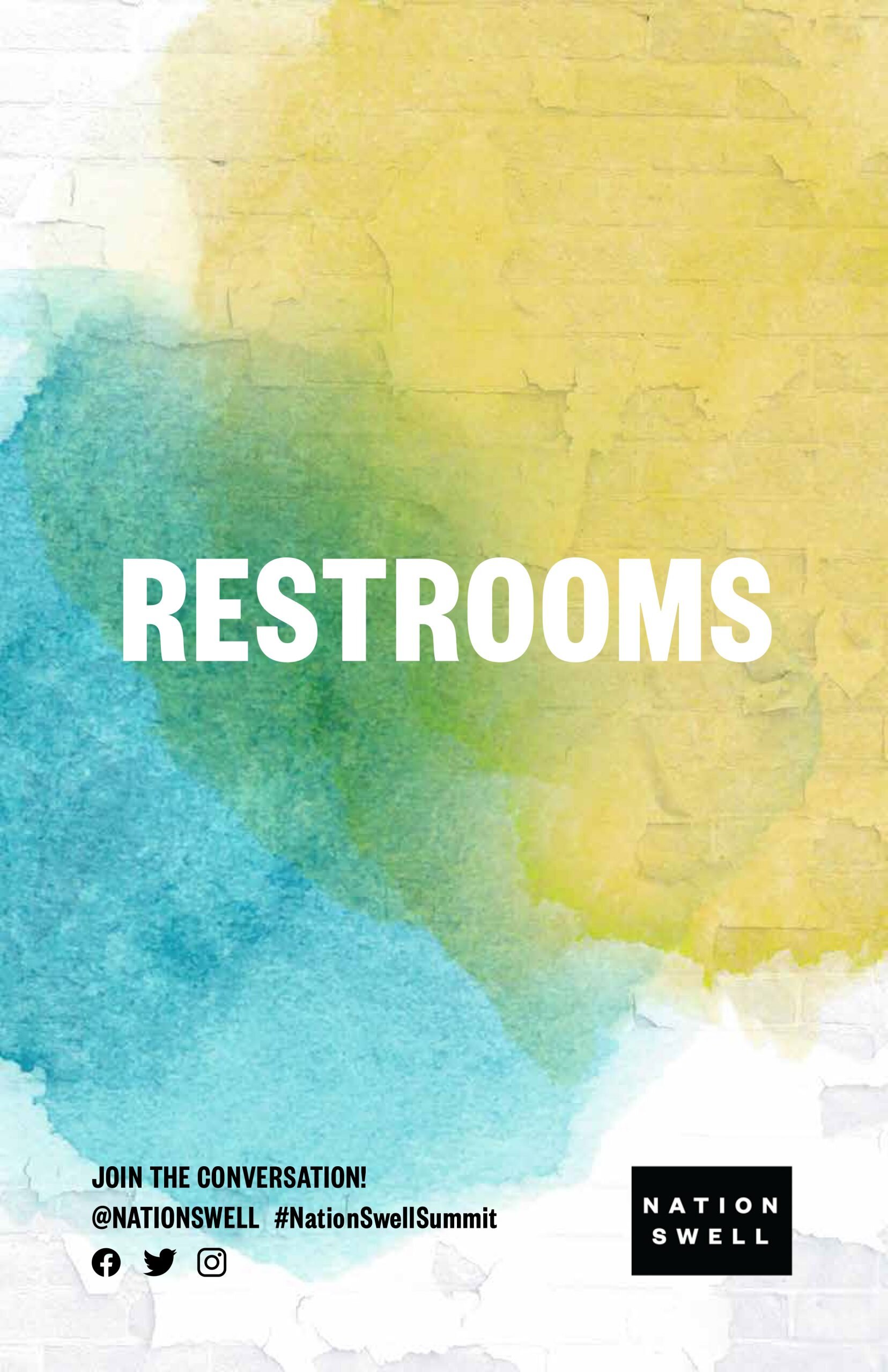
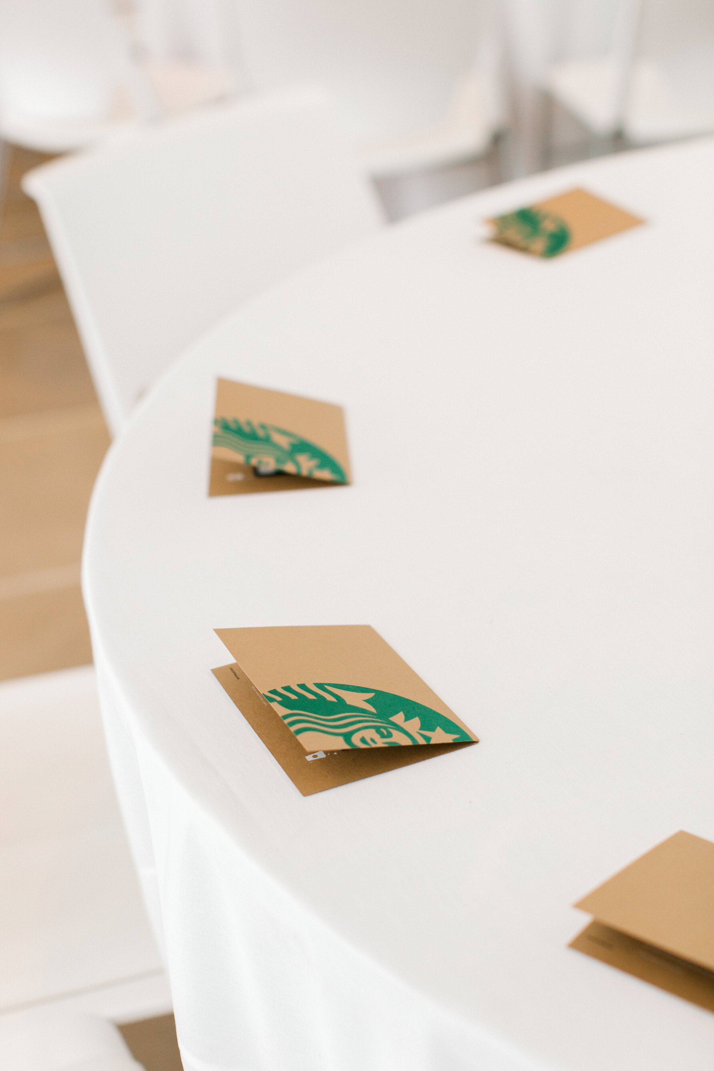
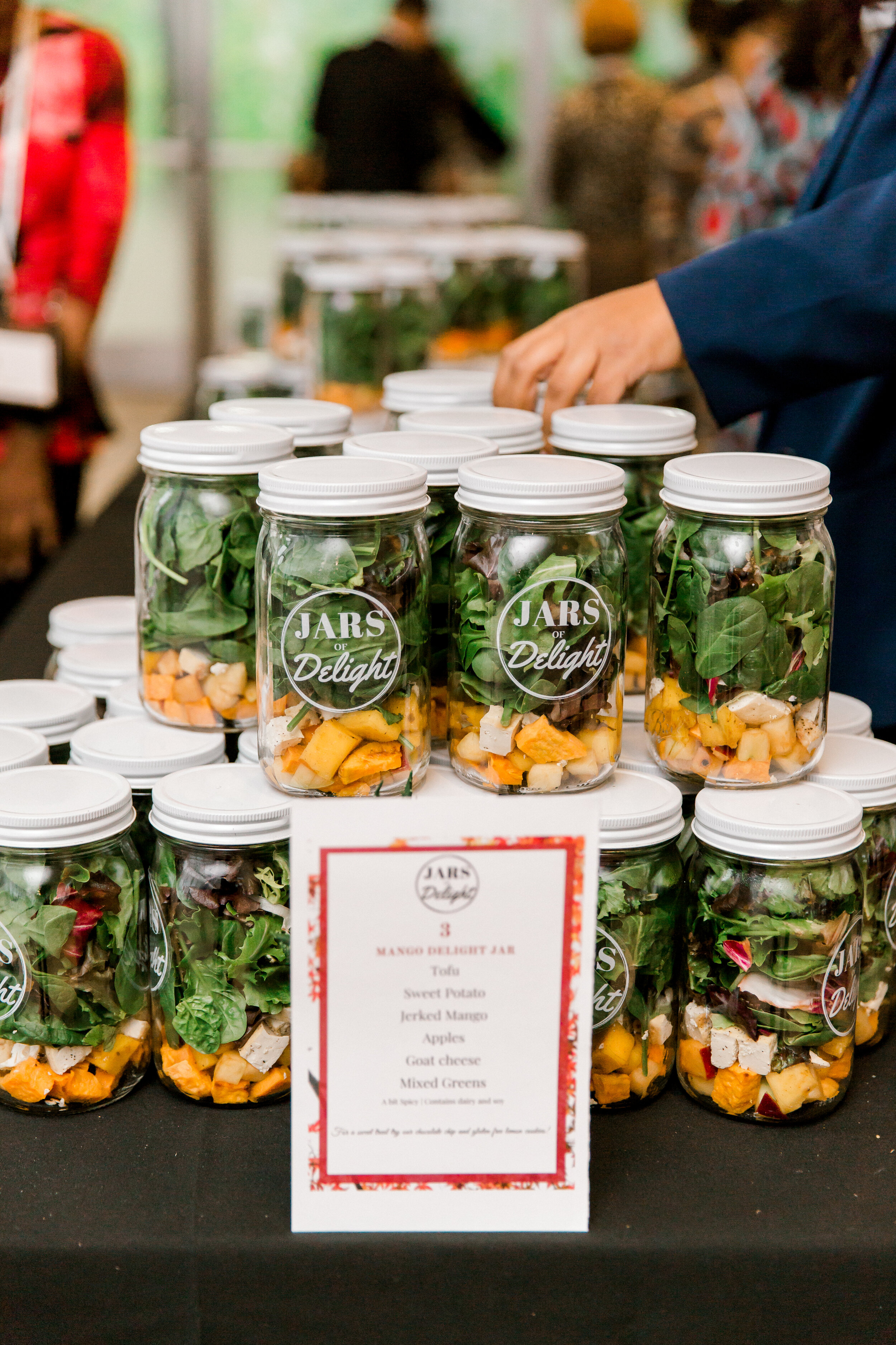
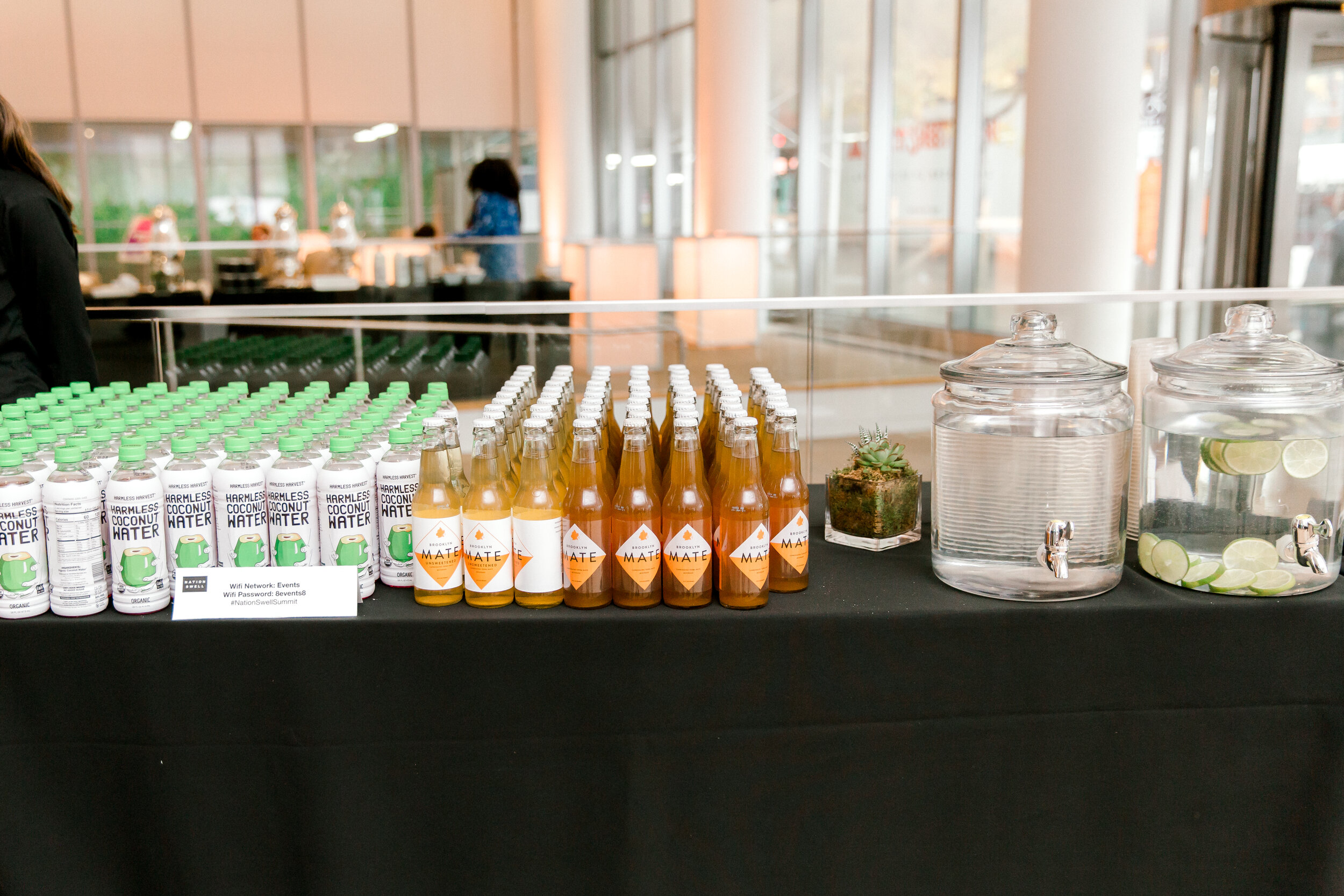
A large-scale collateral system built out the visual identity across wayfinding and signage, interior and exterior furnishing, sponsor activations, and run-of-day experience.
The team
Creative Director: Jessica Lacombe
Design: Ian Goldberg, Taylor Kuhn
Motion: Scott Nelson
Production coordinator: Caroline Healey
Additional environmental and event design samples available on request.